The first time I stepped into Alaina Kaczmarski’s Chicago greystone, I audibly gasped. You see, I’ve been following her homes since the first time I saw her craigslist-decorated living room that looked like it was ripped from the pages of a magazine. We’ve since become not-just-internet-friends and even though I saw blips of the decorating progress along the way, there’s nothing like stepping inside and seeing it all together. She managed to capture a modern traditional style that makes you feel like you’re in a Nancy Meyers movie or that Tom Hanks is about to knock on your door with a freshly sharpened bouquet of pencils. I may or may not have chained myself to her banister and refused to leave.
The best part of Alaina’s home? No, it’s not the sweet dogs or free flowing red wine (although they are both a close second). It’s that she uses time-honored silhouettes and neutral pieces that are truly a style investment and can be used for years to come. Ok, but really… WHO CARES ABOUT WORDS WHEN THERE ARE GORGEOUS PHOTOS TO SCROLL THROUGH.

Full Name: Alaina Kaczmarski, Co-Founder & Editor of The Everygirl
Age: 31
Location: Chicago, IL
Years Lived In: 1
Rent or Own: Rent
Square Footage: 1,600
This vintage greystone is your sixth home in the city of Chicago! How does it stack up to your previous homes? Would you say it’s become your favorite?
10000% my favorite. I fell in love with this style home years ago when I first saw Jenna Lyons’ Brooklyn brownstone home tour. I wrote a blog post back in 2010 that had a photo of her living room with its massive chandelier, English roll arm sofa, and abundance of natural light and wrote: “From now on, when anyone asks, ‘What’s your style?’ I will refer to this photo.” I never actually thought I’d live in one! But it inspired my interior design aesthetic for the past six years. Then I fell in love with Ali Cayne’s brownstone home tour and all of its similarities to Ms. Lyons’, and the two have been cemented in my brain ever since.
I came across the Craigslist listing for this house last December when my husband, Dan Schmieder, and I were displaced due to a gas leak at our previous apartment. I immediately noted the similar architectural elements as Ms. Lyons and Ms. Cayne’s homes (the fireplace mantels, large living rooms, formal entryway, and grand staircase), and I fell in love.
So yes, this is literally my dream home. I love walking up the front steps whenever I come home.
All of that being said, there is one huge similarity between our current house and my past apartments. They’re all great vintage apartments with interesting architectural details and tons of natural light. And with just about all of my past homes, I’ve been willing to sacrifice updated kitchens and baths for that vintage charm. This house is no exception — the kitchen and bathrooms are not only outdated, the cabinets and flooring are cracking and not in great shape. Lucky for us, I’m pretty sure that’s why anyone else who came to look at it passed. Fortunately, Dan is as indifferent as I am about having upgraded appliances. I’ll take an outdated kitchen for a wood-burning fireplace and floor to ceiling windows any day!
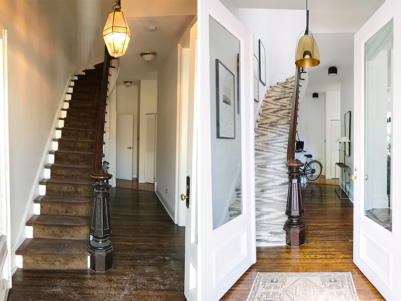
THE ENTRYWAY BEFORE


THE ENTRYWAY AFTER

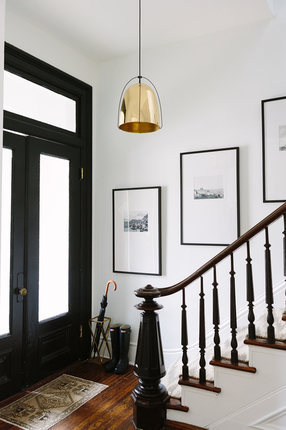


Most people who have seen the “Before” photos of your current place would have immediately passed over it as a rental. How do you look past the obvious pitfalls or problems when apartment hunting? Was there any part of you that was a little nervous about such a big project?
This was and is my dream home, but it wasn’t in great shape when we first looked at it. Worse than I even imagined — so much so we almost passed on it too!
See the before photos here and here.
I’ve never shied away from a little painting project here and there to spruce up a rental. But the tile in the bathrooms and kitchen are cracked in places, the appliances and cabinets are all super outdated, chipping, even falling off in one instance; the carpet in the upstairs bedrooms was really really really dirty and needed to be replaced. There were cobwebs above all of the door and window trim. Fun stuff.
But I saw the fireplaces. Plural. And massive windows and grand foyer and oversized master bedroom (all of my previous bedrooms barely fit a queen bed). Dan saw how excited I was by this place so he was on board, but I was worried it would be more work than I’d want to take on. I actually texted photos to Michelle Adams, another design idol of mine. Her response was something along the lines of “holy crap take it immediately!” Hah, so that helped!
We negotiated with the landlord that we’d sign a two-year lease as long as the bedroom carpets got replaced, the whole place got painted (plus I got to choose the color — Behr’s Ultra Bright White), and the house got thoroughly cleaned.
When we moved in, I knew I wanted to change out the ceiling light fixtures, paint the kitchen and bathroom cabinets, and change the stair runner. I fortunately was able to partner with the kind folks at Annie Selke’s Dash & Albert on the latter which meant we were able to put a much nicer quality wool rug in than we would have done otherwise, but I go into much greater detail about updating a rental on my blog: “What We’re Fixing Up in a Rental and Why.”
THE LIVING ROOM BEFORE


THE LIVING ROOM AFTER


Obviously one of the biggest differences between this home and some of the previous places you lived (like your quaint Lincoln Park one bedroom!) is the size. What kind of challenges did designing in a larger home present in comparison to designing in a smaller apartment?
Just filling it! Every room takes time and it feels like an accomplishment once it’s finished. But then you realize you still have 4, 5, or 6 more rooms to do! That is overwhelming.
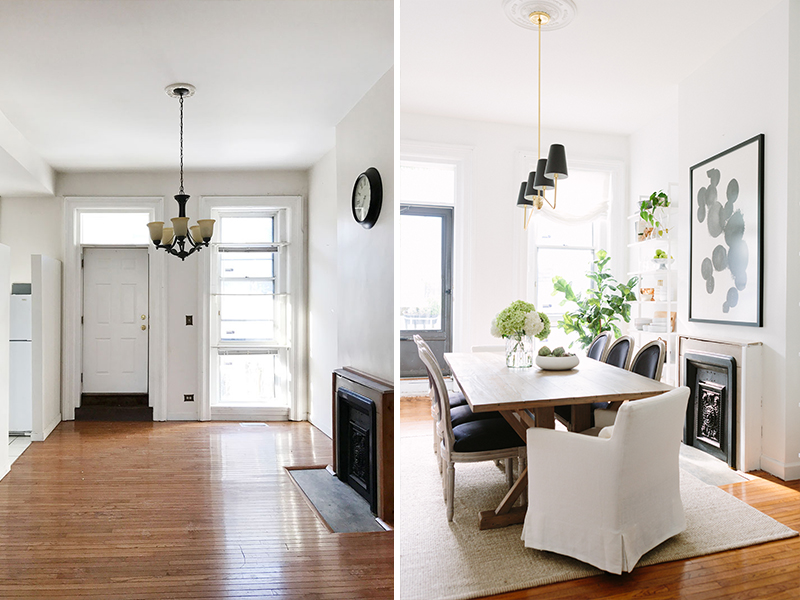
For me, the most challenging part design-wise is when you have rooms that open up from one to the next because you’re essentially designing two or three rooms in one. This was the case with our living, dining, and entryway. I had to make sure the light fixtures, furniture, and rugs complemented one another, so anytime I was choosing one I had to think about what was going in the others since they’d all be visible to one another. Fortunately sticking to a warm, neutral color palette and the theme of a modern take on traditional design helped.
THE DINING ROOM BEFORE
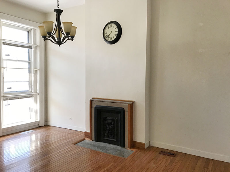

THE DINING ROOM AFTER
Let’s talk about the evolution of your style from your very first Chicago apartment to now. How has your taste evolved over the past few years?
My overall style hasn’t really changed. I’ve always loved traditional pieces and have been open to trying new things. I’d say it just looks a bit older? More mature? A lot less pink and stripes and bows. Hah There isn’t really anything in our place I could see growing tired of any time soon. It’s all very classic.
What was the biggest splurge in your home? Do you have a rule of thumb for deciding where you’ll spend versus save when it comes to decor?
My general rule of thumb is to ask yourself: is this item practical and do you see it / use it frequently? I wouldn’t splurge on anything that gets tucked into a corner or room that is rarely seen. Similarly, never buy something that’s so expensive you’re scared to actually use it. If it’s that special and will make you smile and you’ll use it for years to come, it’s worth it. The biggest splurge in our place was definitely the mirror above our fireplace mantel. And the chandelier would have been a huge investment I was ready to make but fortunately I was able to partner with the team at Candelabra on that item. But I was willing to invest because they’re the first two things you notice when you walk into the living room. I get more compliments on both than on anything in the house and they’re items EVERYONE who comes over sees.
More advice: I’d say err on the side of caution when it comes to splurging on upholstery items, because inevitably they WILL get something on them and possibly stain or tear. Whether it’s from guests, or kids, or pets, or yourself enjoying a glass of wine and a Christmas movie and you trip and spill Pinot Noir all over your beige sofa (this actually happened to me). There are so many great affordable upholstery pieces out there that are worth looking into. The sofa and chairs in our living room are part of The Everygirl Collection for Interior Define, and they’re all on super sale this month (their only sale of the year)! You should check it out.
THE KITCHEN BEFORE
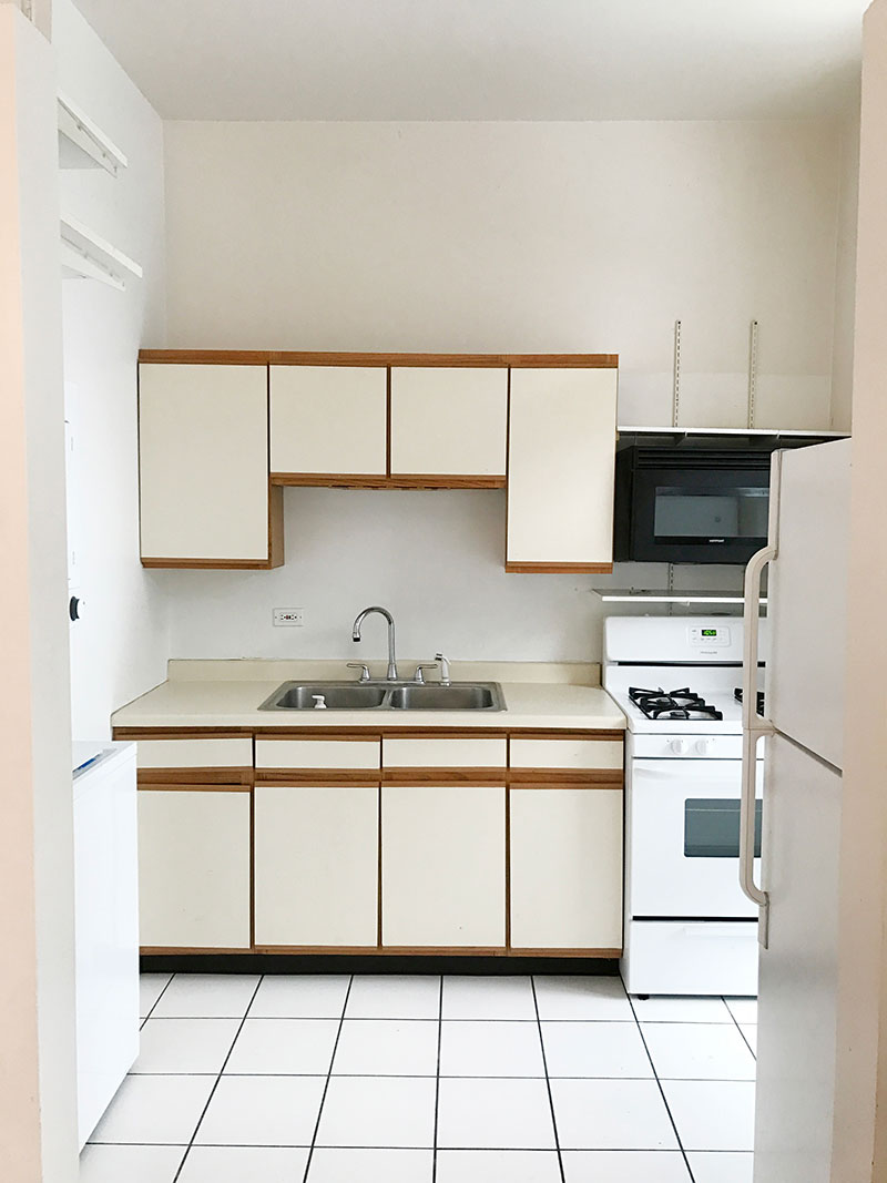
THE KITCHEN AFTER

How do you choose which pieces to purge or keep with each move? What’s your process of elimination?
Whether an item stays or goes when I move really just has to do with whether it has a place and fits, literally, in our new home. I’ve unfortunately gone from a small apartment to a large one, then back to small then back to large three times over now, so there has regrettably been a lot of change-outs. We had a brand new dining table and chairs in our last place that was perfect for that quaint breakfast nook. Now we have a large dining room. So that barely used table and chairs had to be sold. Same with the coffee table — this much larger living room needed a much larger coffee table.
But I am happy to say a lot of this is what we had in our last place — sofa, bookshelves, bedroom chandelier, headboard, bench, living room rug, dresser, lamps, desk, chairs.
I choose items I plan on using for a long time to come. Not simply what will work now. That’s why our new larger dining table is extendable. I assume we might not have this large a dining room in the future, so while I wanted a large table for this home, I wanted to be sure the table could be used in future rooms.
THE MASTER BEDROOM BEFORE

THE MASTER BEDROOM AFTER


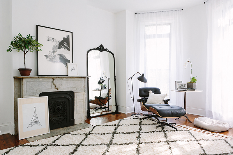


Obviously your pups Tucker and Fiona are a huge part of your family and make your house a home! How do you keep your decor pet-friendly for them?
I have a general truth about pets and home decor: Stuff will get ruined. And that’s ok. It’s just stuff. I’ll try and lay clean “dog blankets” down on the sofa to keep them from laying on the actual furniture, but they just move them over or crawl under them. I never spend too much on rugs because as soon as I lay down a new rug, one of them will eat something outside and then throw up on it. Of course I’ve finally found some great rug cleaners that we keep both upstairs and downstairs.
The best thing I can do is keep their paws clean. Any time we come in from a walk and their paws are remotely muddy, they go in the bath and get cleaned with soap. That is the biggest help. And they get groomed and bathed frequently to prevent them from staining or stinking anything up.
Where’s your happy place in your home right now?
The living room sofa with candles lit, friends all around, wine poured, great music playing, and the fire burning.
THE GUEST ROOM BEFORE

THE GUEST ROOM AFTER


Tell us about your favorite budget-friendly piece that you incorporated into the design.
My favorite budget-friendly piece is the large vintage map of Paris hanging in our living room. Dan and I picked that up on our honeymoon in Paris this spring for around $45, and had to carry it back on the plane oh so carefully.
I also love love the small vintage Turkish rugs in our entryway and kitchen. Those can often times run north of $200-400 but I found them on eBay for $75 each!
THE OFFICE BEFORE

THE OFFICE AFTER




Which before/after makeover are you most proud of in your current home? Is there anything you still want to change or evolve in the space?
Oh man… I know the bathroom and kitchen are the obvious answers because neither were worth looking at when we first moved in. And I am so so happy that painting the cabinets, styling the surfaces, and covering the floors with pretty rugs did the trick.
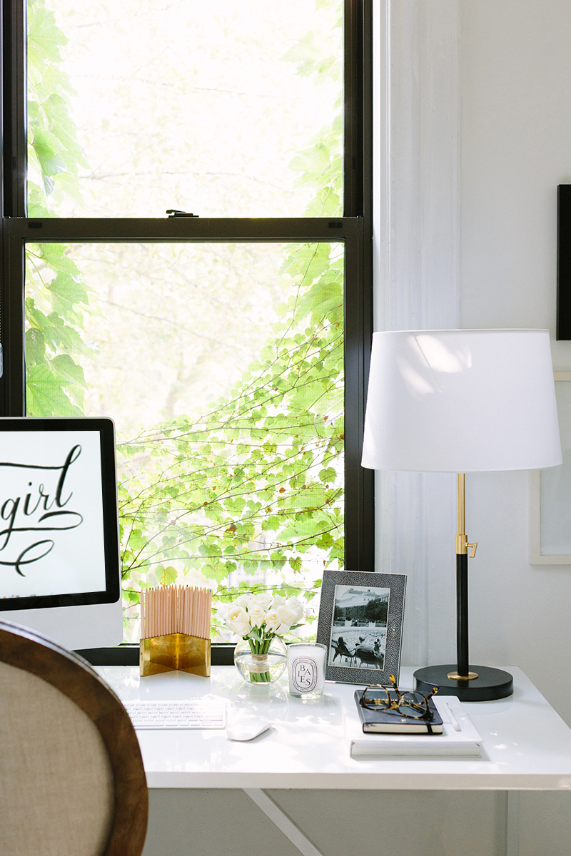
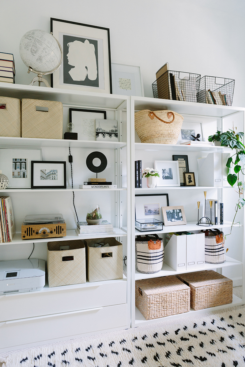
But I have to say I am most proud of the office transformation. That tiny room upstairs was in such. bad. shape. Cobwebs were visible from down the hallway, the light cream carpet had been stained a dirty dark grey. It looked like a room where frat hazing would have taken place. Now — with a fresh coat of paint, new carpet, custom roman shade, and sleek design, it’s a beautiful, inspiring spot to work! It’s also super small but we really made the most of it with storage and functionality. We’ve even had guests stay in there on an air mattress. It’s really quite lovely.
THE BATHROOM BEFORE

THE BATHROOM AFTER


So… let’s take a moment to acknowledge that you decorated this place with a boy. That can be a real challenge! Does decorating with your husband in mind change your style at all?
This question makes me laugh. Haha yes, I do live here with my husband, Dan. But we didn’t exactly decorate together. Allow me to explain…
Interior design has been a passion of mine for as long as I can remember, so I feel very lucky that my husband pretty much let’s me do whatever I want when it comes to our home decor. He respects and loves that decorating is kind of “my thing.” Plus, in his own words, he “is pretty apathetic when it comes to furniture.” Haha I always ask him what he thinks when I’m putting designs together, but he’s pretty sweet and always just tells me it’s great. 🙂
Granted our home is completely neutral and classic, and I try and include at least one or two masculine pieces into each room, since you know… this is his home too. He loves the large brown velvet chairs in the living room, the oversized wooden farmhouse table in the dining room, the Eames lounge chair in our bedroom. I went with more straight-lined white slipcovered dining chairs instead of the rounder ones that he didn’t like as much. All masculine pieces to counter the more feminine accents; so he appreciates that and likes it. That being said, if I had some super girly or flashy taste and was decorating with furry pillows and pink floral patterns, he’d take umbrage.
THE BACKYARD BEFORE

THE BACKYARD AFTER
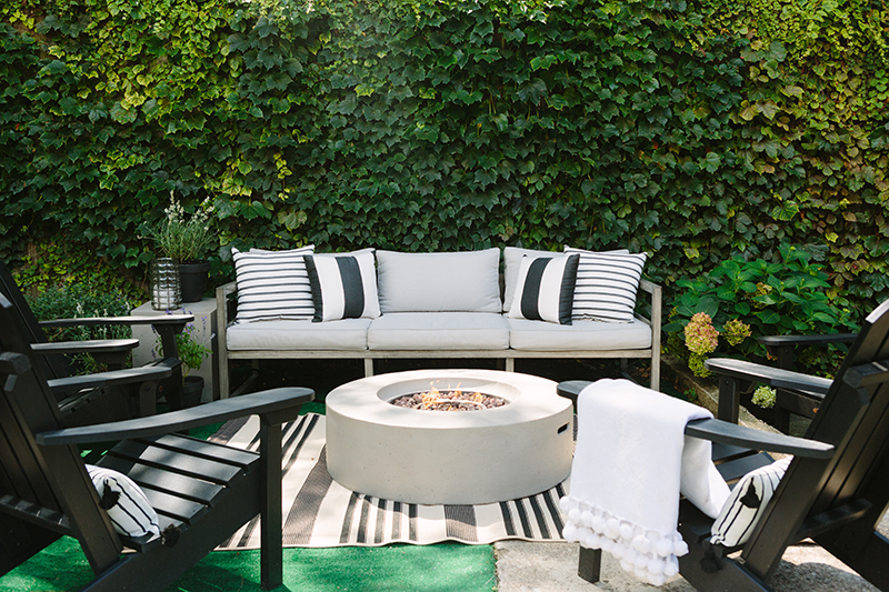


You recently started blogging personally again with the launch of Elizabeth Street Post! That’s really exciting. What inspired you to start back up again, and how does your new blog compare to your previous blog, Live Creating Yourself?
I did! Thank you! It is fun. I’ve missed it so much, and the response from readers has been great. I knew with all the before/afters of this house and our wedding I planned last year, I’d have a ton of great content to share. I think it’s very similar to my old blog… it’s about projects I am working on, trips I am taking, clothes I’m wearing, food I’m cooking. The usual lifestyle content but from a personal perspective.
Everything I write and post is with the intention of helping my readers and Instagram followers get a better understanding of my style and design decisions. I always get asked for styling and decor tips and people want a better understanding of the thought process behind everything. So far so good. I post sporadically but always appreciate the response when a new post goes up. I’m so so excited to decorate for the holidays and fall — so you can expect to see a lot of posts about how I transform this home for fall and then Christmas!
Any last words?
Yes – RENTALS ARE HOMES TOO! They deserve to be decorated even if they’re temporary. Besides, it’s rare any place you live in will be FOREVER so make your house–or studio or dorm–YOURS. It’s so worth it.

Alaina Kaczmarski is The Everygirl…
Typical morning routine?
Sleep in as late as possible… then check email from bed. Once I’m up, I immediately feed my dogs and let them out, make coffee, and get on the computer to start working.
Ideal vacation spot?
The south of France in summer
Celebrity crush?
Joshua Jackson has always been and will always be my celeb crush. Also love John Krasinski.
Perfect day in Chicago?
Taking my dogs to a park or beach, then meeting my friends for dinner and drinks on the town
In five years I’ll be ______.
…hopefully juggling motherhood, renovating a home, and running The Everygirl.
BEFORE & AFTERS




SHOP ALAINA’S HOME // PRODUCT SOURCE LIST
Paint Color
the entire home is Behr’s Ultra Bright White
Entryway
stair runner, Annie Selke’s Dash & Albert
umbrella holder, West Elm
tile flooring, Wayfair
pendant light, Rejuvenation
large mat frames, Framed and Matted
thin console table, CB2
mirror, CB2
skinny lamps, RHTeen
flush mounts, CB2
Living Room
Rose sofa in “Natural Heavy Cloth”, The Everygirl for Interior Define
Caitlin chairs in “Quartz Velvet”, The Everygirl for Interior Define
small tassel pillow, Serena & Lily
large embroidered pillow, Serena & Lily
graphic pillow, Willa Skye Home
coffee table, Candelabra
patchwork hide rug, RugsUSA (see similar here)
Noble chandelier, Candelabra
gold mirror, Anthropologie (size small)
media stand (vintage buffet), MegMade
large modern art (54×40 in white wooden frame), Minted
vertical spine bookshelves, Wayfair
brass plug-in sconces, Schoolhouse Electric
brass curtain rods, West Elm
pedestal table, antique family heirloom
bust, CB2
cloche, Crate and Barrel
coffee table books, Jayson Home
silk faux peonies arrangement, NDI
faux fiddle leaf fig, NDI
large Paris map, purchased on honeymoon in Paris (similar here)
Dining Room
expandable dining table, Kathy Kuo Home
black side chairs, Wayfair (similar here)
white end chairs, Restoration Hardware
modern art above mantel (40×54 with black metal frame), Minted
rug, RugsUSA
linear pendant light, Rejuvenation
linen roman shade, Loom Decor
white shelves, CB2
bar cart, Society Social
Master Bedroom
linen headboard, Kathy Kuo Home
linen bedding, West Elm
stripe throw pillows, The Maryn Shop
white tassel throw, Serena & Lily
nightstands, Anthropologie
faux rose arrangements, NDI
brass sconces, Lamps Plus
shag rug, RugsUSA
floor mirror, RHteen
dresser, Land of Nod
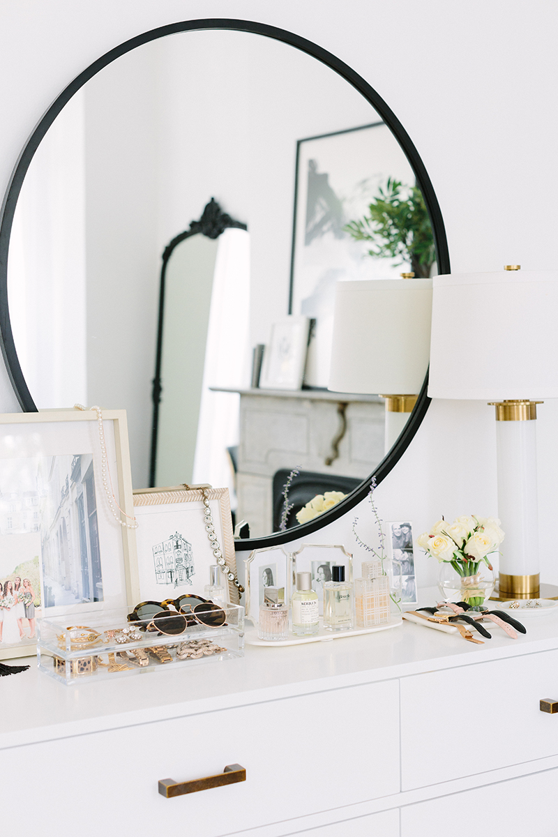
round mirror, Urban Outfitters
curtain rods, Wayfair
sheer curtains, West Elm
large mantel art (30×40 with black metal frame), Minted
marble table, Pier 1 Imports
floor lamp, Lamps Plus
pom throw pillow, Serena & Lily
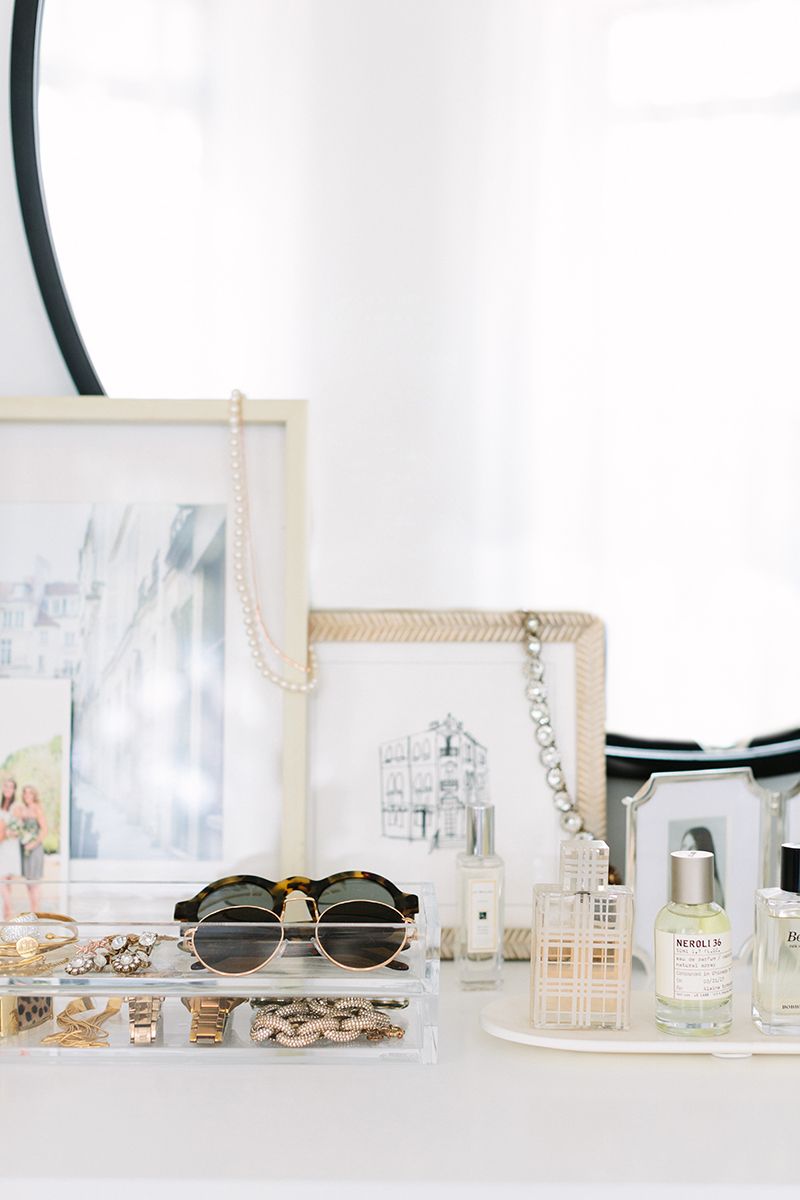
acrylic jewelry storage trays, The Container Store
marble oval perfume tray, Jayson Home
dresser, Crate & Kids
Guest Room
bed, Wayfair
floral bedding, Biscuit Home
nightstand, West Elm
wall sconces, Schoolhouse Electric
Office
desk, Wayfair
chair, Restoration Hardware (similar here)
desk lamp, West Elm
linen Roman shade, Loom Decor
rug, Serena and Lily
shelves, Ikea
square storage bins, Serena and Lily
round storage baskets, Serena and Lily
modern pendant light, Wayfair
chest of drawers, Perigold (sold out, similar here)
gold mirror, Wisteria
portrait art, Josh Young Design House
Bathroom
wire shelves, West Elm
marble shelf, CB2
area rug, Annie Selke’s Dash & Albert
fringe hand towel, Jayson Home
French tassel shower curtain, Serena & Lily
Back Yard
three-seat outdoor sofa, Wayfair
fire pit coffee table and side table set, Wayfair
Adirondack chairs, Wayfair
French bistro dining chairs, Wayfair
striped throw pillows, Pottery Barn
wooden dining chairs, IKEA
wooden dining table, IKEA
striped indoor/outdoor rug, Wayfair
Alaina’s Outfit
silk top, Cuyana
frayed black denim, Express
tassel mules, Sam Edelman


 "
"


