When we first toured the gorgeous home of blogger Kristina Lynne, we thought we’d seen it all — a super chic blend of design styles, a lived-in yet enviable living space, a successful career, and an ADORABLE new baby. But now that we’re checking back in with one of our all-time favorite home tours, we can now officially say that we’ve found everything we’re looking for.
turns out, you don't have to spend all of your free time cleaning
Kristina recently finished designing her living room, and the makeover is seriously something out of a Nancy Meyers set — and we can’t get enough of her minimalistic taste. Here, learn more about the renovations she did (and the ones she chose to opt out of), the furniture she loves, and the ways she can tell that her sweet son loves the room as much as we do.
Name: Kristina Lynne, Interior Design & Blogger
Age: 32
Location: Edmonton AB Canada
Sq. Ft.: 1,700 sq ft (entire home)
Rent or Own: Own
Years Lived In: Almost 2!
We’ve featured your gorgeous space previously, but you’ve made some super exciting changes to the living room since then! What updates have you made?
When the Everygirl toured our home in the summer, I barely had time to touch the living room (with a new baby stealing all my time!). It was technically finished from a renovation standpoint, but I had yet to put energy towards decorating and styling. Now, the living room feels much more lived in and “me” with different furniture pieces (like my Nord Article chairs), accents, and accessories! Though I’m constantly changing things around the house (annoying my husband to no end), this space is finally feeling finished… for now!
BEFORE


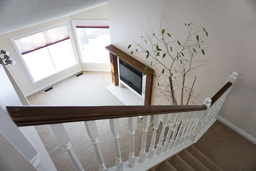

AFTER


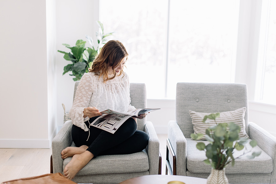

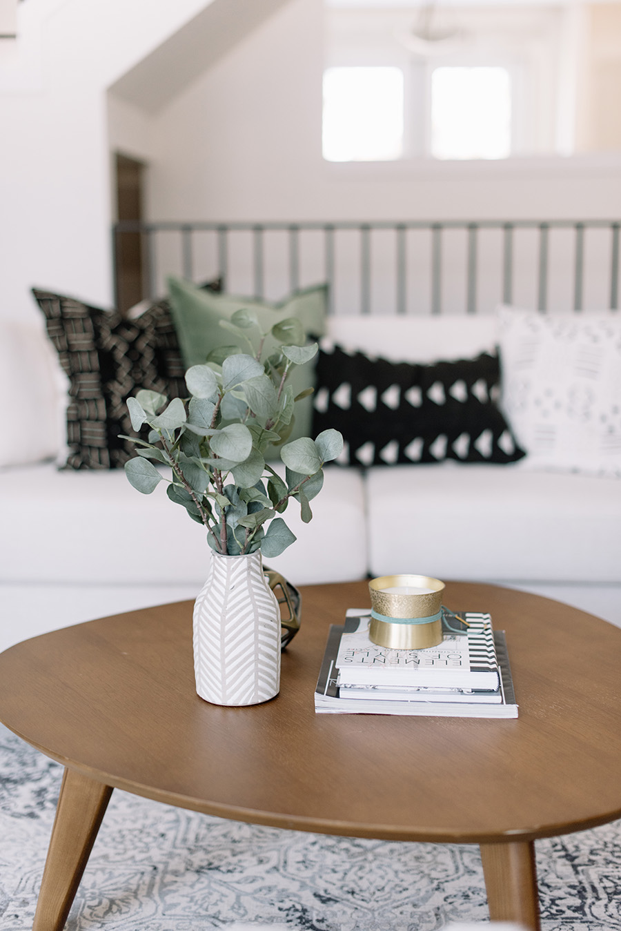
What was the first thing about the room you wanted to change? What did you know had to go immediately?
I had a loveseat that was all wrong in terms of scale. It was comfortable, don’t get me wrong, but it just didn’t fit the room. We entertain a lot, so having two accent chairs in its place was a good problem solver. The space just flows so much better! Plus, I can move them around to accommodate things like our Christmas tree or cozy nights by the fire. And even though it’s more of a formal space, I also felt that with a busy 10-month old, I needed to ditch the heavy coffee table for something lighter, with rounded corners. Having a baby has made me more conscious of certain design decisions.
How would you describe your design style?
I still have to say Scandi meets mid-century modern. A nice blend of the two is my favorite! Also, somewhat minimalist!


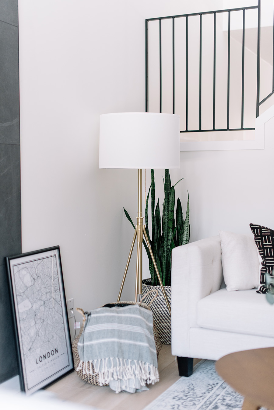


What was your design plan going in for this room? Did the plan evolve as you went?
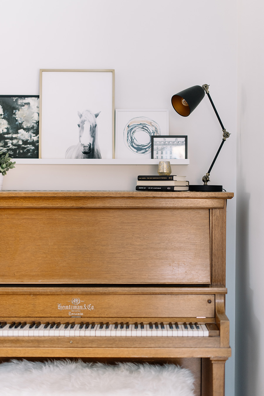
When we first started planning our renovation, the entire main floor was a bit of a puzzle in terms of layout. We initially weren’t sure if this space should be a family room, where we would watch TV, etc., a dining room, or a more formal entertaining space. I finally settled on the latter because the fireplace was too beautiful to clutter up with a TV. And I also wouldn’t compromise on the location of my Nana’s piano — so that really dictated the layout. The rest came pretty easily once we found the right furniture pieces!

A lot of people wouldn’t necessarily think to change railings and banisters — how did you decide on the style you ended up with, and how was the process of changing them out?
Honestly, it looked really strange having a dated staircase towering over this newly renovated space. We couldn’t not change it! Plus, one of our dogs decided to enjoy a bottle of fish oil on the landing while we were away, so we had no choice but to pull out all the carpet. It smelled like fish in our house for weeks lol! But gross smells aside, I knew I wanted to have a clean, modern staircase. I decided to do black metal, with the banister and all the spindles being square. I had pinned so many images of horizontal railings but with Jack only getting more curious, I thought that was a bad idea. So we went with vertical spindles, which, in the end, worked so well with the height of the space. I only had to navigate the stairs without a railing for about a week — which was a touch scary carrying a baby. Otherwise, it was a pretty easy reno that paid off big time!

We NEED to talk about your gorgeous fireplace! Tell us about the process of completely re-designing and renovating that aspect of the room.
Oh my gosh, we honestly love having a wood burning fireplace!! It’s so cozy! But it was quite the remodel! I wanted the fireplace to be the main feature of the room and really draw your eye up, emphasizing the ceiling height and staircase. Initially, I begged my husband to do a concrete surround, but when that proved to be quite pricey, we found this stunning black tile that we could do from the floor up to the sloped ceiling! Installing such big tiles was challenging, but the result was exactly what we were hoping for. We liked it so much we decided not to add a mantel, which, I think, makes it more modern. I added a bit of warmth though by stacking logs underneath, in an opening that was there from the beginning — the one aspect we kept from the ‘before.’
Is the room kid-friendly? How did you achieve that while still keeping the design intact?
Besides having to watch Jack around the fireplace when it’s lit, the room is really kid friendly. I decided to keep all of the baby stuff and toys out of this room, but he still likes to come in here and explore or plunk away at the piano (which is beyond cute). Like I mentioned before, I was conscious of Jack when making design decisions, but at the same time, I still chose pieces that I loved and that worked with the style of our home. I think we managed to compromise pretty well since nothing is too precious in here. It’s meant to be lived in and loved by all members of the family (including the pups!).


What do you love about the room? What’s your favorite part?
Well, it’s hard to beat the fireplace… especially at night when the fire is blazing, music is playing, and wine is flowing! It creates such a great atmosphere. But I also really love our Nord accent chairs and the floor lamp I found. I’ll find myself getting more work done in here now that I have a good place to sit and softer accent lighting.
What’s next on your renovation to-do list?
The kitchen! I cannot wait! It’s the last space on our list, and though the renovation phase will be challenging, it will be so incredible to have a finished house (after two years!!). Wish me luck!


 "
"
