When you’re passionate about your career, your work tends to find a way into your personal life as well. For some, that can be a problem. But for Megan Hopp, that’s just one of the many positive side effects. As a full-time professional designer, Megan brings her excellent eye for style and taste into her home. Not only is the result beautiful, but it’s also unique, fun, and original. She shared her gorgeous home with us, then sat down to discuss the balance between neutrals and patterns, the day-to-day life of a designer, and the advice she has for anyone looking to make a small space feel bigger.
Name: Megan Hopp, Founder of Megan Hopp Design
Age: 30
City: New York City
Rent or Own: Rent
Square Footage: 500
Years Lived In: 7 months
What was your first job, and how did you land it?
My very first paid job out of college was actually as an actor in a musical. I went to college and graduate school for acting, however, while I was jumping from show to show right out of undergrad and living in San Francisco, I got a job at a home staging company as a staging assistant. The world of staging is — in many ways — very different from interior design, however, I learned a lot of fundamental rules about setting up a room, and why it makes sense to put certain pieces in certain places. I also picked up some very fancy towel folding techniques along the way.


What do you love about living in New York City?
New York City is the first place I have lived where you actually run into people you know on the street. New York can seem enormous and heart-stoppingly overwhelming from afar, but once you’re in it, it’s actually very manageable. It’s a real “on foot” type of place, if a train isn’t running, or you can’t catch a cab you truly can walk anywhere, which is incredibly freeing. I love the diversity of the city, of course, culturally obviously, but also from an industry standpoint. It’s so excellent to know so many people who are really right at the core of the field they are in, yet we are all located one block to the next. When great art or design or performances happen here, it’s this amazing hybrid feeling of “I can’t believe I’m seeing this in real life” and “I can’t believe how short my commute home is.”
Tell us about your neighborhood, Carroll Gardens in Brooklyn. How did you choose it? What’s your advice for someone choosing a neighborhood in a new city?
So here is the main reason I LOVE Carroll Gardens — when you walk down Court Street, you see establishments such as a dentist, or a fish shop, a place to do your taxes, a hardware store, and a movie theatre. Coming from my last neighborhood it is heaven on earth to live in a place that feels REAL and not overrun by vague pop-up clothing boutiques, and stores that sell bars of soap that look like glittery cupcakes. With that said the streets are lined with beautiful brownstones, the sound quality is quiet and relaxing, and it’s in great proximity to other Brooklyn neighborhoods like Cobble Hill, and Park Slope. I’m also a six-minute Uber away from IKEA, which is a thing.

What other cities do you love? How does design vary from city to city?
I lived in San Francisco for about five years, and grew up in the Bay Area, so that will always feel like home to me. My apartment now is actually the first “newly renovated” apartment I’ve ever lived in, I’m historically all about the, well historical homes, so of course the SF victorians I lived in fit the bill on that front. I lived in Cambridge, MA for grad school, and again found myself in an old brick apartment building that had so much charm you could collapse. The more a structure looks as though it could crumble to the ground, the more I’m in! New England cities really stole my heart in a way I didn’t expect, always having felt like such a California human.
Tell us about the day-to-day life of a professional designer. Additionally, what’s your favorite part of your day?
I always describe my life and job as feeling like the first day of school, which is exciting and fresh, and notably uncomfortable. The perpetually awkward feeling that comes with the unfamiliarity of new spaces and new clients has subsided over the years, and I’ve settled into the mode of “who am I meeting today?” and “where am I going today?” I love that everyday is different, on Monday I might be in the office all day buried under paint swatches and chandelier options with my shoes off and four cups of coffee on my desk, Tuesday could be an install where I’m driving around town with my contractor (who is my actual hero), and assembling furniture alongside him, or getting nervous as he drills into a pristine tile wall (even though he has NEVER made a mistake) to hang the new shelving. Wednesday could be new client consultations where I put on my real clothes for once in my life. Thursday I finally get to shoot a space after it’s long journey to completion, and Friday who knows?! Most of the time it’s some crazy combination of the above (plus more), but it keeps me ready to go, and it’s hard to get tired of anything when so much is changing day to day. My favorite part of my day is when I’ve just finished a big round of work for a client and hit “send.” The big secret is, as your designer, I don’t know what I’m going to do to your space until I really get into the work. Coming out of a work session I have created something entirely new every time, and it’s as rewarding for me as it hopefully is for my clients.

How would you describe your personal design style?
AHHHH! This question is asked of me so often (rightfully so), and I am truly terrible at answering it. My joke answer is just “wallpaper,” it’s the only thing I can narrow my aesthetic down to every time. I have a list of design elements and particular pieces that I love, and come back to over and over to create a cocktail of a room that feels right to me, but I never can seem to pinpoint what universal style that falls under. I would say 1960s-palm-springs-natural-modern-glam-Scandinavian-farmhouse would be my closet style label. That makes sense, yes?
How has your design style evolved over time, and to what do you attribute that evolution?
I had an aggressive obsession with garage sales growing up, which led to a love of estate sales, which meant I ended up with a stockpile of vintage “stuff.” I literally bought an eight-seater dining table set from a garage sale for $45 when I was 16 and forced my parents to let me store it in the garage until I was ready for it my junior year of college. All this is to say I was a little slow to the game of new pieces, which heavily influenced my aesthetic. As time has gone on I have come around, and come to appreciate the value of a crisp new couch. In my home specifically l’ve landed at about 70% new and 30% old, very much an evolution from my first apartment in NYC, which my former roommate referred to as “the museum.”


Where do you gain inspiration? What do you do when your creativity feels blocked?
I don’t have a hugely fancy answer for this, or any particular technique so to speak for how to get the juices flowing. The less glamorous answer is I have a client roster, and spaces to make, and deadlines to hit, which doesn’t leave a whole lot of flexibility to wait around for inspiration to strike. But I will also say that I keep my eyes open, not just on collections or inventory, or other designers work (all that yes), but to everything that is happening around me, in the city, with the people I know, and especially in ALL spaces I enter. Decorated or not they offer a lot, and that’s where I get most of my ideas, just staring at some ceiling, in some random sandwich shop.
Your home is filled with relaxing, calming colors. How did you choose the color palette?
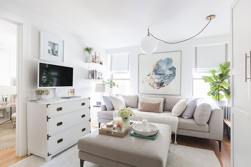
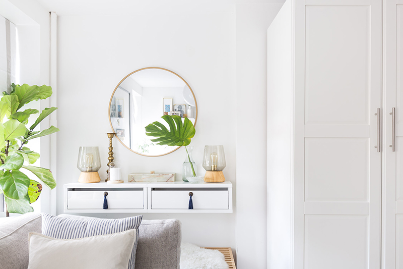
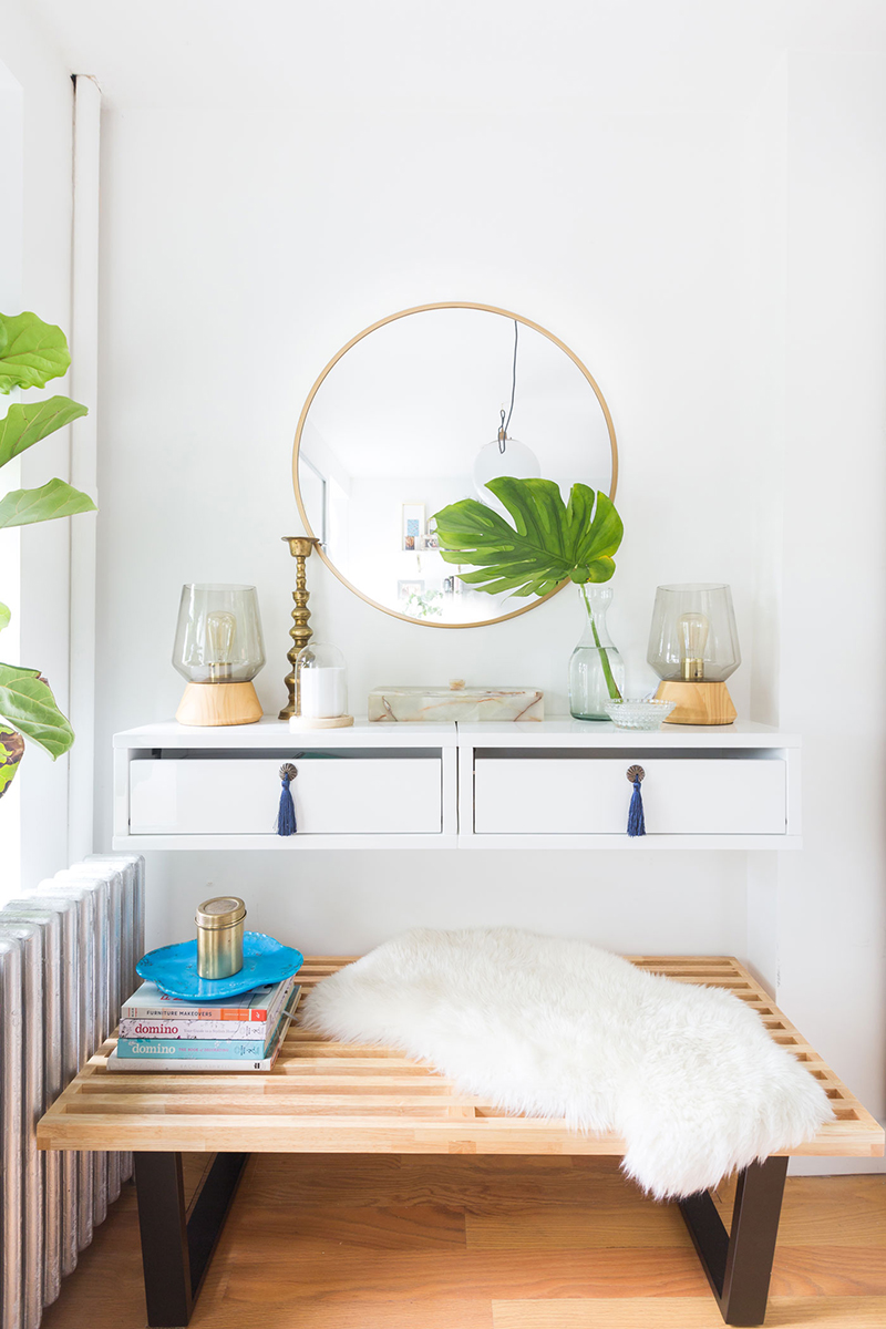
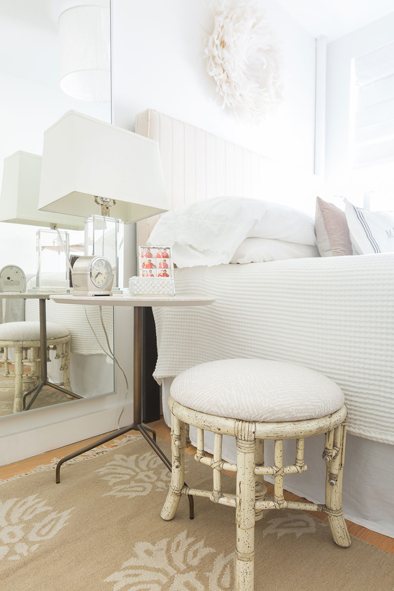
The spaces I make for clients are colorful, bold, vibrant, and not particularly conservative. I love that I attract brave clients who are ready to do it big and bright. My last apartment was like this — really colorful, and very full — I covered my walls from floor to ceiling. However, I also adore neutral calm spaces, and my personal aesthetic has started to simplify as well. I encounter so much stimulating design day after day, I wanted to create a space that I could come home to that was equivalent to palette cleanse. Calm was the goal, but I didn’t go in committed to a particular color scheme from the start. I began with a light grey couch and white rug, and built around that. I had to force myself to keep using white furniture to continue the neutral environment which was really challenging for me! I also have hopped on the blue train this year, and can’t get enough! As such I started to layer in a lot more of that through smaller accent pieces towards the end of the process.


Um, hello. Let’s talk about those bathroom walls. Is it subway tile or wallpaper?
Both! The bottom is standard subway tile with black grout, that was how the bathroom came when I moved in, which was a nice solid treat to build on in any which way. The print above is a temporary vinyl wallpaper that I easily hung myself.
Speaking of wallpaper, tell us how you managed to make patterned walls (like in your kitchen and bathroom) look so neutral — we’re obsessed!
Oh mercy, thank you! That was certainly the goal. Per what we chatted about prior in regard to palette, I really REALLY wanted to keep this apartment as light and airy as possible. The challenge with that was I basically bleed patterns and color. I also get bored easily, and constantly want to add on, so just leaving the wall alone, or painting it a neutral color was not going to be satisfying ultimately. So, like you said, I wanted to try to find paper that was both dynamic and neutral at the same time. I figured I would do one abstract print and one “something else.” I wasn’t specifically looking for a botanical in the kitchen, but rather was scouring this nude blush millennial pink we all can’t seem to kick. I was struck by the larger scale print of the paper, which always gets me. In general I like everything to be as big as possible, print scale being no exception.

How much of the furniture/decor was carried over from your last apartment? What would you recommend to someone who is keeping their furniture but still wants a new place to feel fresh and updated?
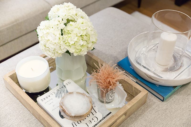
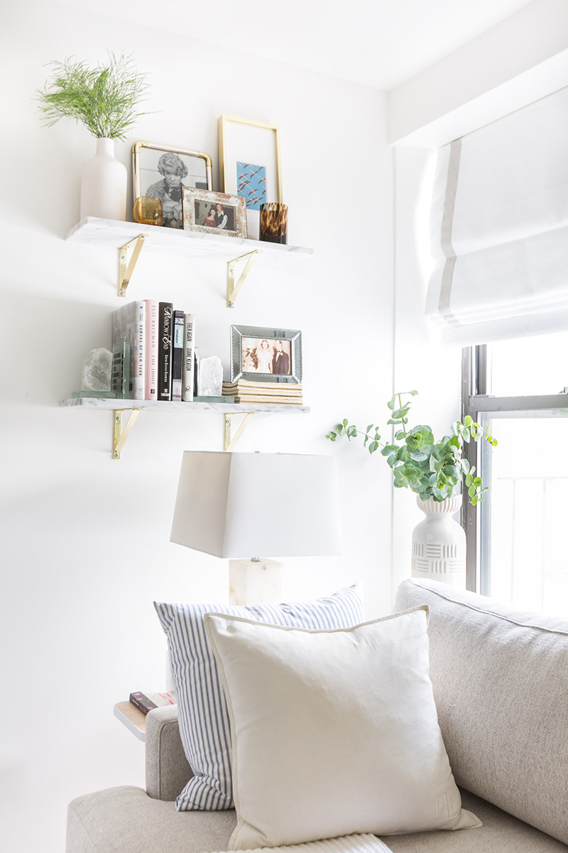
For the larger pieces I ended up getting a lot new furniture for this apartment. In my last space I had actually built or assembled much of the furniture in the space, and couldn’t get it out without destroying it! I also was REALLY ready for a big change, and an entirely new look. Realistically though it’s more common than not to bring your pieces with you of course (as I will most certainly be doing with my next space), and with that there are plenty of ways to make what feels old new again. Switch up your walls and floors, furniture can and will look entirely different against a new color or pattern. I also suggest an overhaul on accent decor, people often skip this very important part of making a space that comes at the end, and I can’t stress enough how much styling can transform a space. I find it so odd that someone who decorates for every holiday on the calendar, can’t quite see the value of a coffee table tray, but believe me it happens all the time! Finally I recommend forcing yourself to NOT hang your art in the same groupings you had in your previous space, fresh combinations and locations will help you see what has been there all along in an entirely new way.
You’ve said that you’d choose a great location over larger size. How do you make a small space feel larger? We’d love to hear your best tips for making the most of a small space!
I decorate, renovate, and design small spaces a lot being here in New York City. I always have a handful of projects on the roster that are teeny tiny, so this is something I think about constantly and have come to have some pretty strong opinions on. My first rule is “You can’t have it all (who can?!), so pick what really matters!” Sometimes I walk into consultations and clients wonder if I might be able to magically double their sq. footage? No, that I cannot do. Make the space comfortable? YES. Create storage? YES. Save you from wasting space? YES YES YES. For instance, in my apartment, I don’t have a dining table, or desk. I have two TV trays (cute ones). I’m not a huge cook, ok actually I’m not a cook at all, and even before I had an office space, when I worked from home I would much prefer to be on the couch than at a desk. When I boiled it down, the couch was a huge priority for me, so I released any idea to try and squeeze some bistro table in the corner that would do nothing more than collect dust, and instead went for the absolute biggest couch I could, and I LOVE it. Speaking of big furniture — that is my second rule, just because your apartment is small doesn’t mean you have to act like you live in a doll’s house, don’t be afraid to fill the space with full size furniture where it counts, it will actually make the space feel larger and more open. Fewer bigger pieces are better than a jam packed room of miniature chairs.`



What’s your favorite part of your home?
I would have to say my bathroom, because of it’s size and it having a real live bathtub (when you’re in NY these things are victories!), which I truly appreciate. My last apartment was so much smaller than this one (if you can believe it), and the times I would truly lose my mind and think to myself “you are literally living like a prisoner in your own apartment” were in my old bathroom that had an airplane size sink, and no matter where you stood your nose would touch the wall in front of you. So lifestyle wise this is an UPGRADE, I basically want to do jumping jacks in there, just because I can.
Where do you see yourself, your home, and your career in the next five years?
Life could be so many things in the next five years of course, but no matter what, making spaces will still be on the table. I’m moving into that phase that many designers hit where they feel tapped out with readily available inventory, so the urge to design my own pieces, prints, and textiles is strong and alive and I hope to see that come to fruition sooner rather than later. I’m very interested in what type of new design television shows could possibly be on the horizon. I think the evidence is clear that there is an audience who would be interested in content beyond homeowner renovations, something more nuanced, varied, and specific, and I’m eager to see what that looks like. I think it’s realistic to assume I could still be in New York, but I’m also very comfortable saying “who knows”?! That whole concept of baby fever, never felt it, BUT my internal clock is tick tick ticking to renovate a house top to bottom for myself by myself, and so in five years I would love to be knee deep in that.
What advice would you give to your 23-year-old self?
The same thing I continue to tell myself everyday. “Nothing is going to look like you thought it would, not at all, yeah, you always knew that, but no really, not at ALL.”

Megan Hopp is The Everygirl…
Design pet peeve?
Inappropriately small area rugs.
Best way to work out?
Manual labor
Guilty pleasure song?
Trans-Siberian Orchestra’s “Carol of the Bells,” only I don’t feel guilty.
If you could have lunch with any woman, who would it be and why?
Kate McKinnon, because she plays any character better than anyone, while also seeming to be no one but herself at all.


 "
"