


Have you ever opened a website and immediately clicked off it again? OF COURSE YOU HAVE. When a site’s design is unpleasant, you’re outta there faster than Cersei guzzles wine on GOT. In a world where everyone is vying for eyeballs, poorly designed sites are setting themselves up for failure.

Never fear, I’ve GOT YOU. As a graphic designer, I’ve rebranded sites for clients using Squarespace (my preferred platform of choice), helping them to optimize the design of their site for their brand and business. I’ve condensed my top tips for creating a beautiful and functional site that any beginner can follow. So grab your notebook (or keyboard) and let’s do this.
Ready to share your vision or business with the world? Start your free Squarespace trial today (no credit card required) and use code ‘EVERYGIRL’ for 10% off when you’re ready to publish your website.
Start with a moodboard
The first thing I do when starting a new graphic design project is create a moodboard — basically a blueprint of where I want the design to go. For reference, here’s an example of a moodboard I created for a project last year. Moodboards are an essential tool in defining your brand’s aesthetic — the look you want to achieve, the feeling you want to evoke, the specific elements that call to you. Did you ever cut out photos from a magazine and save them in piles like curated scrapbooks? *Sigh* Oh, how I miss the days of analog moodboarding.
If you’re not a graphic designer, you can still quickly and easily create moodboards using Pinterest. Secret boards are a fantastic tool for curating imagery — start by pinning anything and everything that catches your eye. Then, go back through your new board and start eliminating things that aren’t exactly right. Don’t feel like you need to limit yourself to images that include fonts or “brand” elements — pin anything that catches your eye! Think about how the images make you feel. What do you want your brand to speak to your customers or audience? After you’ve curated your board, you’ll be left with a reference guide for the look and feel of your brand that you can revisit again and again while setting up your website.
https://www.pinterest.com/kellyetz/website-color-moodboard/
Choose complimentary fonts + colors and edit yourself when necessary
Fonts
I know it can be tempting to play with LOTS of fonts (Squarespace has oodles to choose from) when you’re setting up your site, but step away from the keyboard and listen up for a sec. Too many fonts or fonts that are all similar in design will be confusing to the eye and make it stressful or unpleasant for clients or customers to look at your site. Stressed clients and customers are not ideal when you’re thinking in terms of bounce rate, returning viewers, and eyeballs you want to stay on your site long enough to buy something (at least).
As a designer, this is one of the most common mistakes I see on websites or collateral branding material (business cards, letterhead, etc.), but the good news is it’s an easy fix when you remember these tips:
- Choose three fonts AT MOST. Edit, people! Luckily, Squarespace makes this easy by creating consistent fonts across your site. Choose fonts for Heading 1, Heading 2, Heading 3, and Paragraph (body text) and Squarespace will automatically populate those fonts wherever you use headings or body text on your site. WIN.
- Try choosing a serif (a typeface with flourishes at the end of letters, like Times New Roman) and a san serif (a typeface with no flourishes like Open Sans) that are complimentary. Or, go with two san serifs or two serifs that are different enough for the eye to distinguish. Using two different styles of fonts as your headings and sub-headings will create a pleasing juxtaposition on your site, making it easier to read and giving it a professional polish. Below, I’ve made you this handy guide of some of my favorite font combos — all available on Squarespace — to get you started. You’re welcome. (Be sure to pin it for later!)
- Be careful with script fonts. Over-using them is VERY easy to do — a little goes a long way.
- Never use Comic Sans. You’re better than that.

Color
Next up is colors — the fun part! Take a look back at your moodboard (told you it would come in handy) and pull out the colors that occur over and over again. Once you have these colors, consider color psychology — I love this guide from Spruce Rd. Which colors match the keywords you associate with your brand? If your brand is all about harmony and trust, consider shades of blue. If you’re more about energy and positivity, try yellows. Refine your shades until you hit on a group — I’d say five or six at most — that you like. Make sure you save the specific colors for future use — here’s a great tool on finding the hex code of a color from an image if you don’t have any design software like Photoshop or Illustrator.
You can easily copy a hex code into Squarespace to use that exact color on your site — here’s how:

Understand hierarchy + balance
Remember that infamous Oscars snafu? All of that could have been avoided with hierarchy — that’s how ~critical~ it can be to a design.

Source: Good
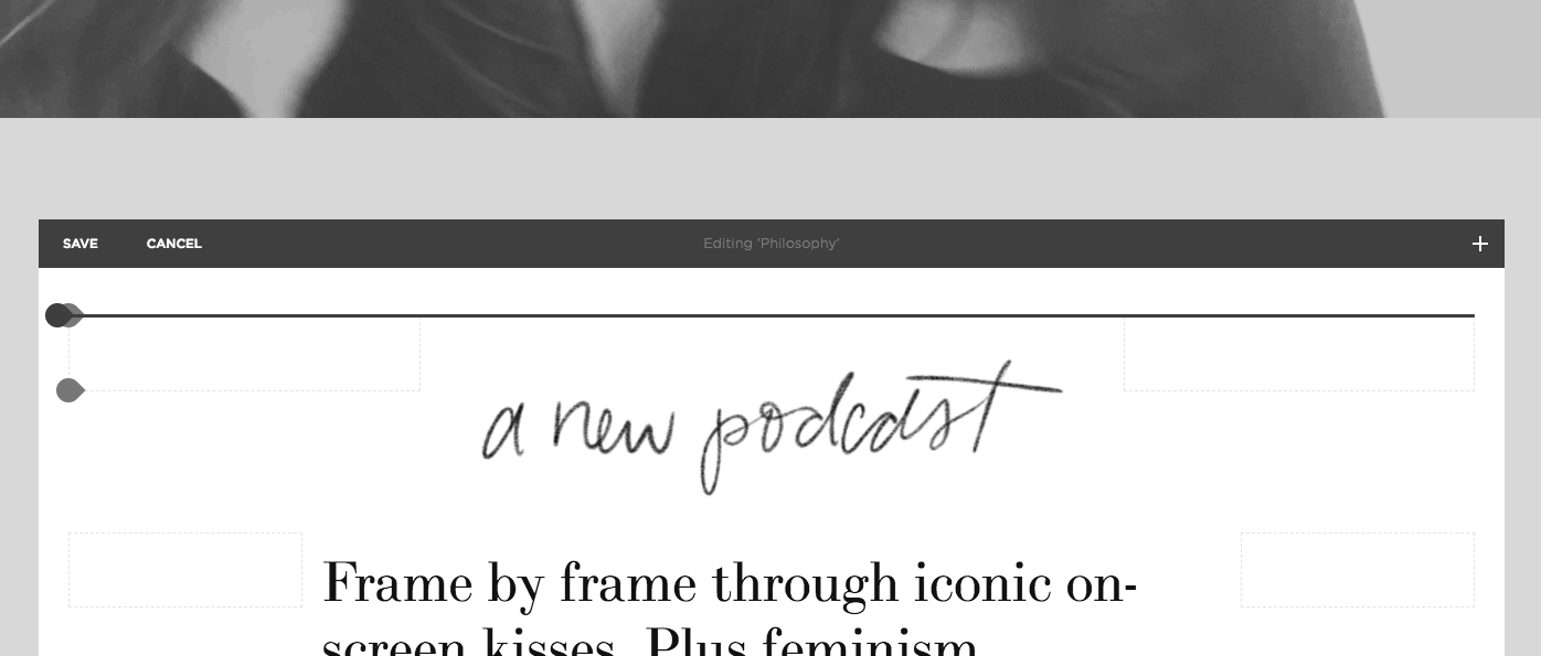
Creating hierarchy within your site prioritizes the text you want your viewers to see first — think bold calls to action, product titles, etc. Using hierarchy ranks your content and creates a path for a viewer’s eye to travel — so they can follow the story of your site the way you intend it to be seen. Here is an example of how I created hierarchy on one of my Squarespace sites:

Balance is equally as important as hierarchy, as it anchors your site and helps make it more pleasant to the eye — key to retaining viewers. Each element on your page has a certain “weight” that should be balanced. Dark colors and thicker lines are heavier, lighter colors and fainter lines are lighter. Here’s an example of how I created balance on one of my Squarespace sites:

Be strategic with white space
I LOVE WHITE SPACE. Whenever someone asks me to give my design opinion on something they’ve created themselves, my inevitable advice is “more white space!” First thing to note is that by white space, designers mean negative space, or the absence of design elements, text, or images. The space doesn’t necessarily have to be white to qualify.
Think of it as giving your elements room to breathe. Just as you wouldn’t use a photo with half of the top of your head cut off, you don’t want to add text and images to your site when they are too close together — it will come off as cramped and uncomfortable to the eye. More white space = a cleaner, more modern design. I love the “spacer” tool in Squarespace for easily creating white space around your elements when you need to. Here’s an example:
Create consistent graphics
Consistency is key in creating a site that flows smoothly from element to element, page to page. Utilizing the same fonts, colors, and images across your website will create a streamlined design — and be easier to produce in the long run. Win, win.
When making your site, or after your site is completed, you might need to make graphics — such as pinnable blog post images, downloadable checklists, Instagram posts, etc. — to integrate seamlessly with your website design. Creating templates for these graphics will speed up your day to day workflow and ensure your site and social channels always look professional. If you don’t have access to Photoshop or Illustrator, I recommend using either Powerpoint or Canva to create your graphics, both of which allow you to save templates.
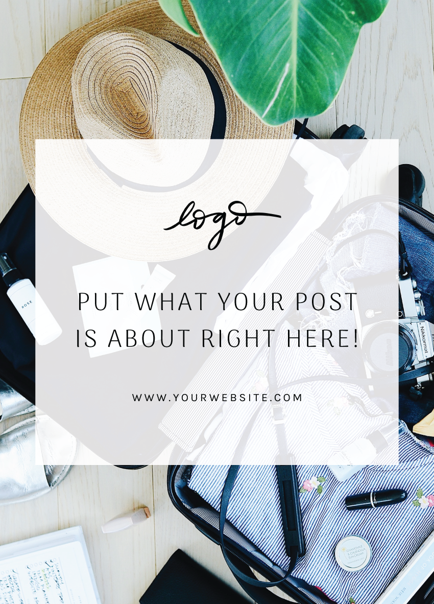
Here’s a good starting template for a pinnable blog post graphic:
And here’s a good starting template for an Instagram text graphic:

Finally, simple does not mean simplistic
Remember that a beautiful site doesn’t have to be “full” of elements — in fact, very few beautiful sites these days are. Minimal sites are pleasing to the eye and often quicker/easier for beginners to produce. Squarespace makes it easy with lots of pre-made templates that are both beautifully minimal and functional. Bing bang boom done.

Ready to share your vision or business with the world? Start your free Squarespace trial today (no credit card required) and use code ‘EVERYGIRL’ for 10% off when you’re ready to publish your website.
Do you have questions about the design of your site? Share in the comments below and our graphic designer will provide her feedback!
![]()
This post was in partnership with Squarespace, but all of the opinions within are those of The Everygirl editorial board.
