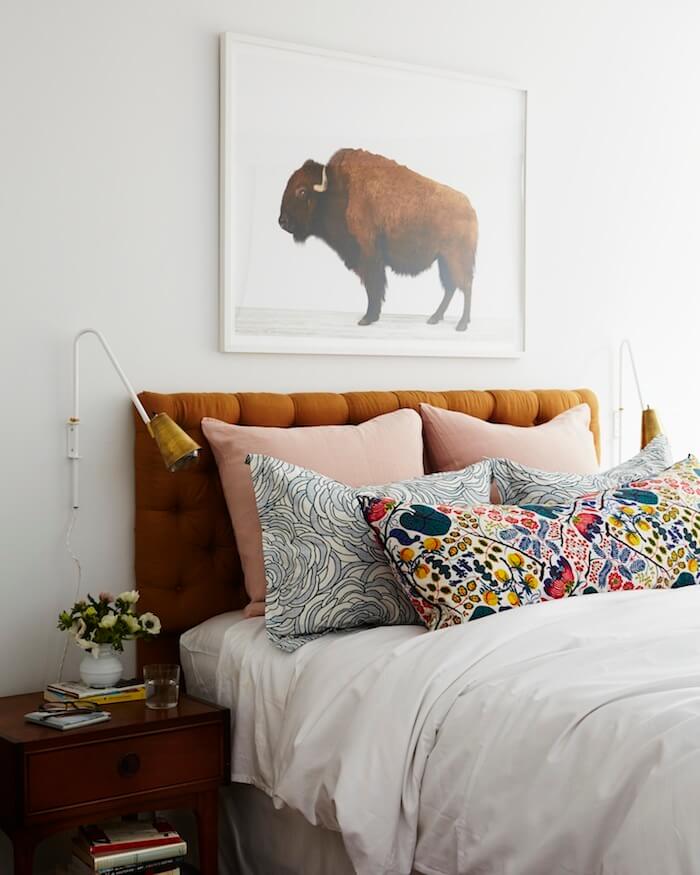
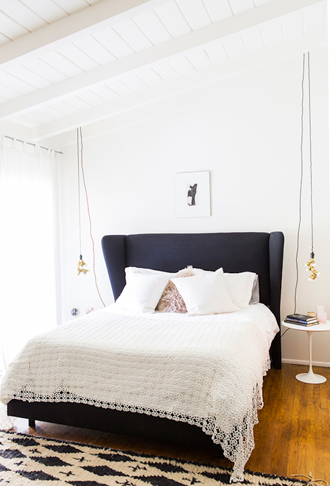
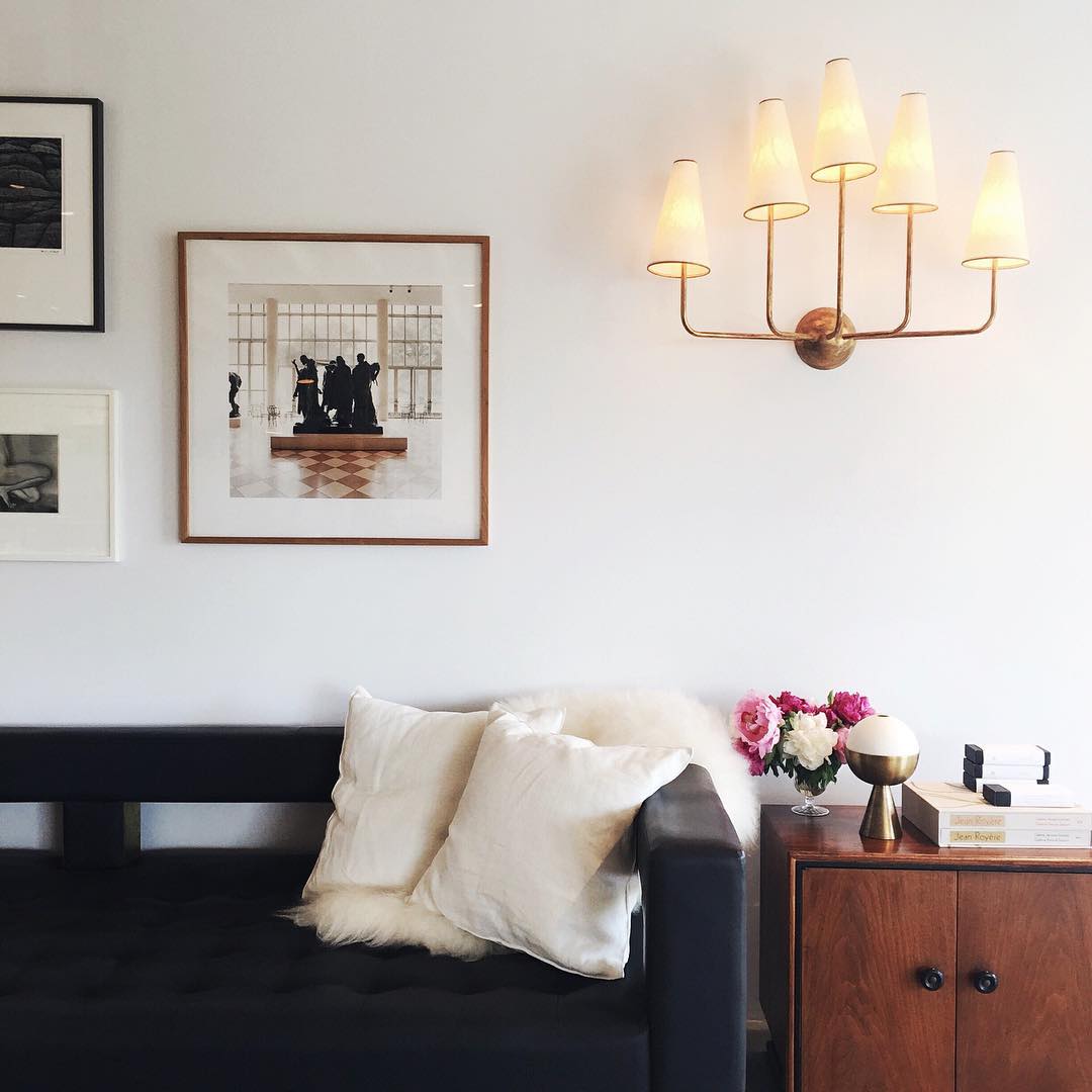
In a perfect world, I’d invite over my favorite designers to my empty home for brunch and we’d discuss design plans and inspiration over organic waffles and mimosas not made with Andre. In reality, I can barely afford the four dining chairs I want (until then it’s folding chairs at my place), much less my favorite designers’ services.
So here I am, overloaded with Pinterest inspiration and screenshots from Instagram, contemplating hunting Emily Henderson down at the Rose Bowl flea. There’s a good possibility my living room will end up looking like a garage sale mishmash or a try-too-hard set from “Mad Men.” Neither are ideal (unless Don Draper comes with the second option), so I reached out to a few seasoned experts to get their advice on creating the mid-century vibe in a small space. From designers who are setting the trends we can’t stop pinning, to furniture creators and bloggers dissecting the trends, each of these ladies knows what works in a room and what doesn’t.
“Start small and style simple.” – Emily Henderson
 Source: Emily Henderson
 Source: Amber Interiors
 Source: Sarah Sherman Samuel
Emily says: “Mid-century is all about sleek shapes and wood with a strong retro vibe. To bring it into your own space without feeling like you’re living on a set of ‘Mad Men,’ focus on bringing a few simple key pieces in, like a mid-century inspired chair or a simple wooden dresser or credenza that has mid-century styling to it.”
“The mid-century vibe also evokes a much more clean and sleek approach to decor. If you aren’t ready to commit to some mid-century furniture, then clear off your table or surface and get yourself some mid-century inspired candle sticks or a simple wooden tray or bowl to keep some of your most important items corralled without adding to the clutter. My book ‘STYLED‘ walks you through the process of styling out each surface in your house step-by-step, and it’s also filled with pictures to help you through that sometimes daunting process.”
CLICK HERE FOR MORE OF EMILY’S DESIGN ADVICE
“Design with one or two mid-century statement pieces in mind.” – Becki Owens
 Source: Becki Owens
 Source: SF Girl By Bay
 Source: Emily Henderson
Becki says: “I love the mix of modern, mid-century, and even bohemian styles to create a more updated eclectic design. When incorporating mid-century, I like to focus on key statement pieces like a mid-century chair or a really cool mid-century console so the whole room isn’t mid-century, but a new eclectic design evolves that is fresh and curated looking.”
CLICK HERE FOR MORE OF BECKI’S DESIGN ADVICE
“Incorporate multi-functional pieces.” – Victoria Smith, SF Girl By Bay
 Source: Sarah Sherman Samuel
 Source: Emily Henderson
 Source: SF Girl By Bay
Victoria says: “The great thing about mid-century modern design is that it was created around the idea of functionality, so pieces are streamlined and efficient. For instance, I don’t have a lot of dining room space, so I brought in a round tulip-based dining table and around it added vintage armless tulip-based dining chairs that swivel. They tuck nicely under the table and the fact that the table is round creates much better flow in a small room.”
“Mid-century modern sofas—like the Case Study Daybed—work beautifully as a sofa, but can fold down into a bed at night. A daybed is the perfect piece of furniture for an office or second bedroom because it can instantly accommodate overnight guests, but offers great-looking extra seating during the day.”
CLICK HERE FOR MORE OF VICTORIA’S DESIGN ADVICE
“Plan the layout of your room before purchasing any new furniture.” – Joybird
 Source: Emily Henderson
 Source: Emily Henderson
 Source: A House In The Hills
Joybird says: “You might love your huge, comfy leather sofa, but you may hate that it takes up nearly all of your living room. Evaluating furniture size is an important step in optimizing your small space. The general rule? Large rooms need large furniture. Medium rooms need medium furniture. Small rooms need small furniture. It may sound simple, but it holds true. Grab a tape measure and measure out how large a piece is in your room before purchasing it. If you are worried about walkways, use blue painter’s tape on the ground. That couch you thought didn’t look THAT big online, suddenly swallows your room. Instead of investing in one bulky piece, think about breaking up your seating into equally comfy chairs or a loveseat/chair combo. This will not only give your space some room to breathe, it will also make it appear bigger simply because of the array of objects within it.”
CLICK HERE FOR MORE OF JOYBIRD’S DESIGN ADVICE
“Let your furniture take center stage with white walls.” – Sarah Sherman Samuel
 Source: Amber Interiors
 Source: Alpha Smoot
 Source: SF Girl By Bay
Sarah says: “Real wood is a beautiful signature of mid-century modern style, so I recommend painting the walls white to let the natural wood furniture take center stage. I look for whites that don’t skew too yellow or too blue, and are bright but not too ‘I live in a gallery’ bright. A few of my favorite neutral white paints for walls are Snowfall by Behr, Decorators White by Benjamin Moore, and All White by Farrow & Ball.”
CLICK HERE FOR MORE OF SARAH’S DESIGN ADVICE
“Mix wood tones.” – Becki Owens
 Source: Glitter Guide
 Source: Studio Gorman
 Source: Monica Wang
Becki says: “Don’t be afraid to mix in the beautiful medium wood tones you see in mid-century furniture. These tones add a modern warmth to a space. I especially love adding them to crisp white rooms and rooms with a neutral palette.”
“Less is more.” – Liz Bachman, Grey and Scout
 Source: Grey and Scout
 Source: Amber Interiors
 Source: House of Hipsters
Liz says: “Mid-century design is all about the ‘less is more’ mantra. That’s the beauty of this particular style; you can let the unique furniture speak for itself. You don’t have to layer rooms with a ton of pieces and accessories. Keep it simple.”
CLICK HERE FOR MORE OF LIZ’S DESIGN ADVICE
“Pick a fun vintage rug to contrast against wood tones and white walls.” – Amber Lewis, Amber Interiors
 Source: Becki Owens
 Source: Sarah Sherman Samuel
 Source: Vint Agency
Amber says: “When designing a mid-century modern space, it’s important to add a piece that ties everything together and adds interest to the space. I always throw in a fun, colorful vintage rug to contrast against wood tones and white walls. Without it, a room can feel rather cold, but a patterned rug can be the perfect piece to add life to the space. It can also be the perfect addition to accent tones and patterns in the room, making them stand out more.”
CLICK HERE FOR MORE OF AMBER’S DESIGN ADVICE
“Brass accessories FTW.” – Monica Wang
 Source: Monica Wang
 Source: Sarah Sherman Samuel
 Source: Monica Wang
Monica says: “Accessories are one of those things that can be swapped in and out of a space regardless of their size. Brass has become a classic staple for interiors and I don’t see it going away in the near future. It’s also easy to find brass picture frames, trays, and objects at vintage shops that make a home look more unique and less commercial. The last thing you want is for pieces in your home to look like they’re all from a single store, so mix it up as you decorate!”
CLICK HERE FOR MORE OF MONICA’S DESIGN ADVICE
“Add in pillows of all shapes, colors, and textures.” – Monica Beisen, Boho Pillow
 Source: Amber Interiors
 Source: Lauren Peelman
 Source: Amber Interiors
Monica says: “The first rule of mixing pattern is…there are no rules! But for those of us that weren’t blessed with the natural ability to do so, here are a few tips I swear by to get started.
Determine your color palette: This is where all of the fun starts because color is the powerhouse of this operation. Take time to decide what colors you want to draw from in your room. I find it easiest to start with an area rug and draw up to three colors from it to incorporate in your pillows. If your rug is neutral, take any other colors you have in your room into account, as you’ll want to play off of those.
Mix pattern scale: Pulling from your colors, you’ll want to mix up different pattern scales and print variety. Typically, you’ll want to have an equal variety of pattern scale, including small, medium, and large patterns. Mix in your medium- and small-scaled patterns around your large-scaled patterns so that it’s visually cohesive. And don’t forget your pattern variety, which means you’ll want a blend of geometric prints, organic prints, and if it starts to feel too crazy, add in some solids!
Mix texture: By varying the levels of texture, anywhere from a furry pillow on one end of the spectrum to a woven cotton (like mudcloth), you can easily add another element of interest.
Mix size: For sizing, keep in mind that pillows will look smaller than their listed size, since they lose a few inches to depth, once filled. Because of this, I always recommend sizing up rather than down. Don’t forget to mix up your pillow sizes and shapes, because a pattern mix master like yourself doesn’t want to be around total squares!
Play with it: If you’re unable to have samples on hand, put all of the product photos you’re considering together, and look at them right next to what you’re trying to coordinate them with (whether it’s a rug, furniture, bedding, etc). Keep in mind, your eye won’t lie—If you place everything together, chances are, the pieces that don’t jive will jump out at you first.”


 "
"