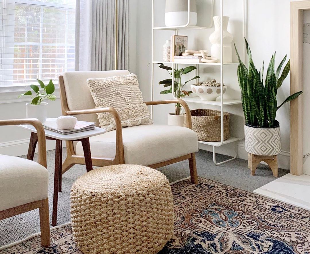
Those of us who pay rent instead of a mortgage know full and well that there are some eye-sores you just learn to live with. Lord knows I’ve had my fair share of dated light fixtures, awkward floor plans, and questionable “kitchens.” Heck, a part of me even enjoys the challenge of seeing what kind of transformation I could pull off with such limited resources. But up until last year, I always had one hard and fast rule when it came to apartment hunting: no carpet.
turns out, you don't have to spend all of your free time cleaning
Ah. I was so young then.
You see, last year I moved to New Zealand. Unbeknownst to me, I quickly found out that they LOVE carpet here. In fact, I would say that 90 percent of the homes that I’ve seen on the South Island are carpeted. It’s a practical choice—the houses are incredibly cold (insulation is more of a perk than a requirement in these parts) and carpet helps keep your home warm in the winter. Of course, as is the case with most rental finishes, the majority of carpeted homes on the rental market aren’t exactly sporting the high-end options. To my dismay, there’s no wall-to-wall sisal to be found. It’s more like indoor/outdoor carpet, or (if you’re lucky) an inoffensive, medium-pile beige.
The biggest challenges that you’ll face when designing with a typical, builder-grade carpet are making the space feel clean (i.e. not old or dingy, since carpet tends to show its age in a not-so-charming way), or, if it’s brand new, making the space feel like it has character. Wood floors or even tile immediately lend a sense of warmth that can be tricky to capture with standard carpet options. But ya know what, ladies? We are scrappy. We have a vision. We can make lemonade out of this rental carpet. Ahead, I’m sharing my top five tips to make the most out of any carpeted room in your home.
1. Layer in a patterned rug
Haters will say that layering a rug over carpet is a bad idea, but then you show them this photo and prove them wrong. My very own living room (as seen here) came equipped with a low-pile, charcoal grey carpet that made the whole room feel dark and dingy. By layering a lighter rug that still ties in that same charcoal grey (thanks to its pattern), the whole space instantly feels lighter, and the carpet merely feels like an extension of the rug.
2. Draw the eye up with art
A rule of thumb: the more you love the bones of your home, the less you need to decorate. In a space with gorgeous herringbone floors and floor-to-ceiling windows, you could plop a couch in the living room and call it a day. If you’re dealing with a few quirks or lackluster features, you’ll want to spiff things up with decorative pieces that keep your eye moving around the room. Carrie Waller of Dream Green DIY has lovely, plush carpeting, but those of us who are less fortunate can learn from her display of colorful art above the sofa, which immediately draws the eye away from the floor.
3. Make it fresh with “new” pieces
I’m a major thrift-store junkie when it comes to home decor. Seriously, my local Salvation Army knows me by name. However, if you’re dealing with a dingy or dated carpet, adding in too many vintage pieces on top can make the whole space feel dusty and old as opposed to charming. Instead, add balance with a few new pieces. A pair of sleek, modern chairs feels instantly pulled together, but if you’re on a budget you can still make an impact by bringing in smaller accessories, like matching lamps or patterned throw blankets.
4. Add character with “vintage” pieces
…Or perhaps you find yourself on the other end of the spectrum. Maybe your carpet is in great condition, but it feels boring. Bringing in some vintage or thrifted finds will add instant charm and strike the perfect balance between “old” and “new.” Remember, you can always infuse character with larger furniture pieces, like a credenza or coffee table, but you can also opt to bring in vintage pieces in smaller ways, like thrifted wall art or accessories for your bookshelf.
5. Bring in more texture
If understated is more your style, take a note from Taylor Sterling’s home office, where neutral textures are the name of the game. By bringing in sheepskin throws, woven accents, and varying metal finishes, she’s able to achieve a relaxed, minimalist vibe by making the textured carpeting fit in effortlessly with the rest of laidback decor.


 "
"
