When she’s not professionally designing interiors for hotels, Ciarra Celiano is constantly transforming her Chicago apartment into a calming and clean escape from the city. Originally built in the 1920s, she has found the perfect combination of keeping the vintage feel of the building alive but still giving the space an updated and modern touch. We had the opportunity to interview Ciarra and learn more about keeping plants in a home, making your own headboard, and maximizing functionality in a small space. Keep reading to discover this interior designer’s favorite styling trends:
Name: Ciarra Celiano, Interior Designer
Location: Lincoln Park, Chicago
Sq. Ft.: 600
Years Lived In: 2
Rent or Own: Rent
What was your first job and how did you land it?
Right after graduating college, I was hired by the The Ohio State University in the Office of Student Life Facility Planning and Design Department, where I worked on several residence hall renovations and new builds around campus. I had interned there for two years prior to graduating, so it was a smooth transition into 9-to-5 life. This was a great jump start into the commercial design industry and really taught me how to work creatively within a team setting.
Tell us about your current profession. Have you always been interested in interior design?
Yes! Every since I was a little girl I remember spending countless hours in my bedroom rearranging my furniture and begging my mom for a trip to IKEA and a fresh can of paint. I inherited the design bug from both her and my Gimi (aka Grandma) so she was willing to humor me with a small budget and a paint roller.
I now work as an interior designer for a hospitality design firm, where we focus on three-to-five star hotels across the country. I love that this career is a blend of both residential and commercial design, because I can still be detail-oriented and create spaces that are comfortable and inviting, while also keeping in mind that they will be experienced by new people every day.


How was designing your own apartment different than styling for work?
So much less planning up front! When I am working on a project at work, everything — from the space planning and artwork locations to the material selections — is accounted for in advance of the installation. It has to be done this way for logistical purposes. It was the complete opposite for my apartment. Naturally, I had an inkling on where certain pieces would be placed before moving in; however, I did a lot of it by just reading the space after I moved in. It has evolved a lot over the past two years as I have collected new furniture and artwork along the way. It is almost like a scavenger hunt in the sense that I would find new things that belonged in the space that I didn’t even realize I was missing.
What were some important features you were looking for when you were apartment hunting?
Character! I’m a sucker for old buildings with all the molding details and unique features — they just don’t make them like they used to! As soon as I saw the built-in glass display cases in the kitchen, I was sold.
Since I was moving into my own apartment for the first time, it was also really important to me that I felt safe in the space, so I took some time to explore the neighborhood before signing the lease.
You moved into such a cute, vintage apartment building. Did you have to do any updates to the space or did you want to leave it in its original form as much as possible?
The building was an old hotel from the 1920s, so it has great character — but there were a few elements that were added later that were not original to the rooms. Prime example: golden oak cabinetry in the kitchen. Both the built-in display cases as well as the walls and molding were white, so it didn’t feel right to leave the cabinetry in the tiny kitchen a wood tone. Thankfully, my landlord was on board with me painting the cabinets white and adding some decorative hardware. It really brightened up the space and tied everything together!


Lincoln Park is so cute! What is your favorite part of living in this neighborhood?
I don’t think I can pick a favorite! I LOVE this neighborhood. The proximity to the lake and park creates the best escape from the hustle of the city, even though it’s not really far at all. I also love the fact that everything is super walkable and well connected to public transportation. The best mornings are spent wandering the side streets and finding an entire block of beautiful, old Chicago homes and wondering who used to live inside.
Since you live in a convertible studio, what are your best tips for maximizing functionality and staying organized in a smaller space?
Do not succumb to “the chair!” We all have “the chair” that is the collect-all for unworn outfits and everyday coats and purses. I tried my hardest to not have that chair because no matter how well the space is designed, in a small space, your eye will always land on that chair filled with discarded items. I know its hard — trust me!
Also, organized, concealed storage is your friend! This is especially important in my kitchen since I have limited counter space. I only want to cover surface spaces with items I really love and that have meaning to me.
Can you tell us a little bit about your design style and your inspiration?
It’s so hard to classify a design style, but I’d like to think that my style would be considered worldly and lived-in. I have a blend of clean-lined, modern elements juxtaposed with ornate and worn vintage items. It is really important to me to have a balance of the two not only for aesthetic purposes, but functionality as well. I am really inspired by the feeling that apartments across Europe evoke; bright and ornate shells filled with modern and collected furnishings.
Your headboard is amazing! Can you walk us through how you made it?
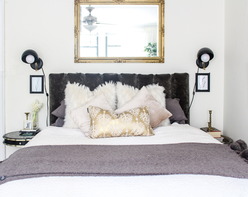
Thank you! I had a specific look in mind but couldn’t find any fitting options that were in my budget. After some research, I found a wall-to-wall channel tufted headboard tutorial by Emily Henderson. It wasn’t exactly what I was going for, but the basic idea of the construction worked, so I followed her steps and made my own dimensional and orientation modifications.
I was able to source the fabric from Valley Forge through my contacts at work and the foam through The Foam Factory. I also took advantage of the fact that Home Depot will cut wood to size for you at the store because there was no way I was getting a saw into my tiny apartment.
Once all the materials were assembled, it was basically like wrapping eight giant presents and attaching them all together.
The whole thing wound up costing around $175 and at the end of the day, its special to me because I made it with my own two hands.


I love all your vintage pieces throughout your home. How did you manage to find the perfect balance between vintage and modern?
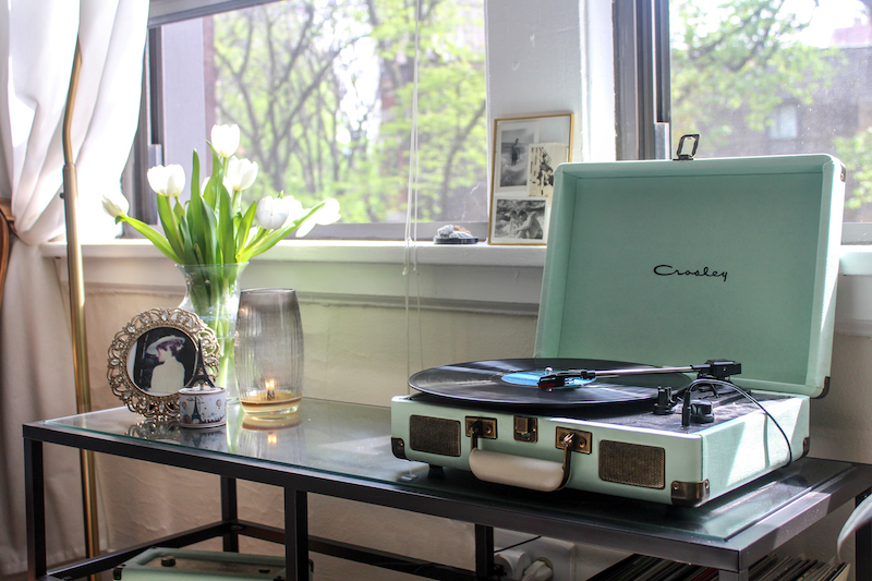
Thanks! My Mom and Gimi both have impeccable taste (and used to own a furniture store of their own) so I was lucky enough to have a few special pieces passed down to me when I first moved in. Since I have limited space, I knew I needed to balance the more ornate and focal pieces with clean and simple ones. Things like the bookshelf and console table were going to display a lot of items so I wanted those to be simple and almost fade away to let the decor shine.
Do you have any advice for styling a bookshelf?
Balance is key! I think it is important to have an even amount of similarly sized items throughout. I view the bookshelf as serving not only a decorative purpose, but also a functional storage space for my books. By mixing up the styling of the books, it helps make it feel a little more decorative and not as rigid. Mirroring a shelf layout is always an easy way to achieve balance.
Were there any quirks in your apartment you had to design around? If so, tell us about them.
Since the building itself is really old, the heat comes from radiators, which are never fun to deal with — especially considering the paint job is well past its prime. Nevertheless, it’s part of the vintage apartment package that I couldn’t eliminate so I worked around them. I concealed the peeling, painted tops with decorative tile to even out the surface, and depending on the room, added a few accessories to the top.
Also, like many old apartment buildings in Chicago, my walls are all plaster, which is extremely limiting when it comes to mounting anything to them. Because of this, I utilized the beautiful-yet-functional picture molding that extends throughout the entire space. Gold picture hooks and clear fishing wire helped me get the artwork display I was looking for without too many vertical lines interfering with the art itself.


It looks like you’re a big plant mom! Why is it important for a space to have greenery?
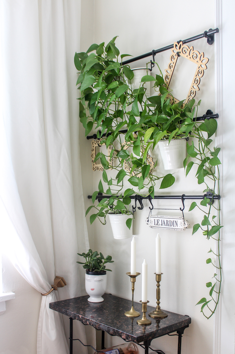
Plants make people happy! Due to tight quarters, I tried to keep my overall color palette neutral and bright, and living plants are the perfect color balance. In my opinion, they add this soft, ever-evolving color and texture to a space that you just can’t quite replicate. Also, when the morning light comes in the windows, the leaves quite literally light up the room.
What are some of your favorite design trends happening right now? Which ones do you wish would end?
I love the fact that the sustainable and organic trend happening in food and wellness right now is translating into the design world. I am obsessing over natural fibers and raw and textural materials. It’s comforting to see the design industry begin to be conscious of what kind of materials we are introducing to a space and how and where it is made.
It’s so hard to pick a trend I want to end because I think everything is so project and location specific! However, I think I am ready to see the chevron pattern make its graceful exit.
What are some of the first steps you take when designing a space?
In both designing for myself and at work, the first thing I consider is what story the space wants to tell. Everything has a story that needs to be unearthed, and interior design is a great catalyst for this. Every decision that is made in regards to design is going to ultimately evoke a feeling, so it is important to determine the direction of the narrative before making any design decisions — big or small.


Before moving into this apartment you lived with roommates, how did you know it was time to live on your own? What made you feel like you were ready?
It was a combination of situation and being ready for something new. I have always been a very independent person, so when the opportunity presented itself, I made the jump! I think that living alone is so important for everyone at some point in your life if you can make it work. You learn so much about yourself and really grow into your own person.
What’s your favorite thing to do in the summer in Chicago?
Be outside! Summer only lasts for about 2.5 seconds around here, so I try and take every opportunity I can to be outside. From sitting on the riverwalk during lunch breaks to Saturday morning Farmers Market adventures in Lincoln Park, Chicago really is its best self in the summertime.
What advice would you give your 22-year-old self?
I would tell my 22-year-old self to not be so worried about checking boxes! Everything happens when it is supposed to, and if you follow your passions and trust your instincts, you will find yourself in a place that you are truly happy in.

Ciarra Celiano is The Everygirl…
Last item you splurged on?
DeLonghi Espresso Maker
Last book you read?
The Nightingale by Kristen Hannah for like the 10th time. It’s my favorite — I can’t stop!
Home essential everyone needs?
Good candles and at least one living plant.
Coffee order?
Non-fat cappuccino from Cafe Umbria
If you could have lunch with any woman, who would it be and why?
Audrey Hepburn in Paris or Rome. She’s always been my girl. She overcame so much adversity and then went on to give so much back.
Favorite Instagram to follow?
Kate Marker Interiors + South Loop Loft for design inspiration.
Pasta Grannies because they make me smile.


 "
"