There are few things that interest us more than a shocking before and after, so when we came across Sarah Jacobson’s NYC renovation, we had to know more about it instantly. Between her apartment’s pre-war charm and her sheer talent and bravery to take on such a large project single-handedly, we had questions—and lots of them.
European Wax Center is offering your first bikini, underarm, or eyebrow wax completely free—no strings attached.
Sarah’s pre-war apartment needed some serious help when she purchased it. With no experience in renovations, she decided to steer the creative vision and project management on her own to make it a home, and the results are swoon-worthy.
Vintage elements like exposed brick and an antique clawfoot tub help the historical charm of her apartment shine, but modern art, light fixtures, and furniture are mixed in to create the perfect balance between old and new. If the thought of this excites you and makes you want to call a contractor immediately, you will love this interview with Sarah where she explains every detail of her Lower East Side apartment renovation.
Name: Sarah Jacobson
Pronouns: she/her
Location: Lower East Side, New York City
Square Footage: 700-ish
Rent/Own: Own in a co-op building
You are originally from Massachusetts and moved to NYC after college. What brought you to NYC to begin with?
I moved here to work in advertising! I had interned at an agency the summer before my senior year and had been told that if I got myself to NYC, a job offer would follow. My move to New York coincided with the 2008 recession, and so though I had indeed relocated (to a tiny and dark apartment in the East Village), no job offer came. Companies were laying folks off left and right, and I spent my first 1.5 years in New York scrounging up an income via freelance writing gigs (I kid you not, I spent hours writing 800-word, SEO-optimized articles about watches). My parents offered to help me pay my rent for the first year in New York in lieu of grad school, an incredible privilege that ensured I could afford to stay, and within a little over a year, I had my first real job as a copywriter. I’m forever grateful to them for that gift; I don’t think I’d be in New York without it.
Before you became a homeowner, you lived in a few apartments. How did you make those temporary spaces feel like home, especially with roommates?
I was never afraid to do a bit of work to my rentals, whether that meant building a lofted bed, swapping out lighting, or painting an accent wall in the hallway. I think sometimes people hesitate to make “big” decisions in rental spaces, thinking they’ll be dinged by their landlord or that it’s not worth the effort. But this is your home! Home is worth the effort, even if you don’t intend to stay forever! And so many of those seemingly “big” decisions aren’t as difficult as they seem. Swap out your boob lights for pretty fixtures, and then put the boob lights back before you move. Paint your bedroom a fun color, then paint it white before you move out. I never once regretted putting a bit of time and money into my rental apartments, as that’s what made them feel like my own. As for my roommates, most of them were down to let me do my thing, so long as I ran it by them first!

When you bought your apartment, you knew that it was in desperate need of renovations. How did you have the bravery to take on such a large project?
Honestly? I didn’t have the bravery, not completely, anyway. The best way to describe my emotional state at the time was what Glennon Doyle calls “scited”—a mix of scared and excited. I was unqualified and in over my head, and a part of me knew it. But at the same time, I could not wait. I’ve loved design since I was a little girl (much to the chagrin of my parents, who had to put up with the constant rearranging and redecorating of my bedroom), and the idea of being able to make like all the bloggers I loved and design my dream space from scratch was thrilling!
Undertaking such a big project on my own (though I had a contractor and a team of workers, all the project management and creative vision came from me) was at times overwhelming, but like so many things, doing the big scary thing showed me that I could. I’d never before had to fight a contractor about why my “weird, trendy” tile floors were the right choice or argue with a countertop fabricator who explicitly ignored me when I told him I wanted a breakfast bar with an overhang and instead fabricated a “flush to the cabinet” piece. But each time I had those arguments or pushed through sexism to achieve my vision, it got a little bit easier, and I got a little bit braver. It’s no wonder I’m itching to do it all again 😉

We can’t get over how well you’ve maximized space in your entryway. There’s storage, that glorious accent wall, and even a little workspace! How’d it all come together?
Thank you! That entryway space actually looked quite different when I first saw the apartment. There was a closet where my work space is now, and a weird little nook where my entryway storage is. When I knocked out the closet to build a breakfast bar and open up the kitchen, I knew I needed to find another home for coats and such. I showed my contractor entryway inspiration images, and worked with the guy who was building out my closets to create a custom unit that perfectly fit the nook. I had them build as far up as they could (every inch of storage counts in a small apartment!), and had a bench cushion made out of an old textile I found at Melrose Flea years ago. Today, that space is home to my coats, boots, and cleaning supplies.
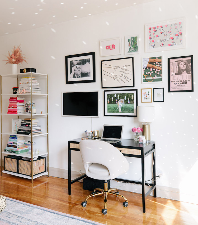
Lastly, my work space. Real talk: that was a breakfast bar until Covid hit, and sometimes I feel a lil pang of sadness when I see old photos of it sans giant monitor. But, such is life! Things happen, and we have to pivot. I’m so thankful I happened to have that space to work out of; I think I’d go nuts if I had to sit at my dining room table every day. About a year into WFH life, I splurged on a comfier counter stool, which was a game changer, and I try to keep my work stuff as cute as possible to preserve the prettiness and serenity of the space.
Do you have any tips for making the most of a small space for fellow apartment dwellers?
Oh my goodness yes. First off, utilize the one above: build up! If you’ve got 9 foot ceilings, use every inch of ’em! Look for functional furniture—benches with storage in it, media consoles that can hide all the things, under-bed boxes to store your out of season sweaters. Storage solutions have come a long way in the past few years, so if you can swing it, invest in prettier baskets and boxes to corral all the things (I love Open Spaces, who I’ve had the pleasure of working with in the past!). That way, what “open storage” you do have (bookcases, bar carts and the like) isn’t just a pile of things but rather a styled collection. One of the things I love about living in a smaller space is that doing so forces you to be purposeful. All of my bigger pieces are functional, and all of my smaller ones have a story. I’m also generally a follower of the “one in, one out” rule: if I buy something new, I try to give something away. I do a big closet clean out once a season, and give away the pieces that no longer speak to me; I do the same for my home at least once a year. That helps keep things streamlined, and ensures my closets and cabinets aren’t overflowing at all times.


The wallpaper in your foyer is unlike anything we have seen before! Tell us more about where you got it and why you chose it.
Though my entryway isn’t a separate space, I wanted it to make a statement and have visual separation from the rest of the apartment. Enter: wallpaper! I’ve always loved the Daydream wallpaper from Hygge & West (I first spotted it in a friend’s apartment on a nursery ceiling) and thought the gold colorway would perfectly compliment my giant antique mirror (which I bought off a neighbor for $25 years ago). Paired with the Moravian star pendant (from Worlds Away) and vintage runner (from Etsy), the entryway is its own little mood.


What do you consider to be your design style and where do you think it comes from? I’m sure it has evolved over time, but do you find yourself getting inspiration from any place or person in particular?
I always struggle to answer this question, in part because I think so much of good design is about listening to your space. A mid-century modern house in Palm Springs is going to tell you it wants to be something different from a pre-war apartment in Paris. That’s not to say you can’t go Parisian in Palm Springs or go uber-modern in Paris, but I think there’s something incredibly special about paying homage to the bones or the history of a home. There are a handful of designers who I think do this incredibly well, Jessica Helgerson being my #1. She’s a pro at adapting her style to the space, whether it’s an old firehouse-turned-coffee shop in Brooklyn or a tiny house in Portland.
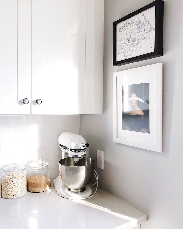
All that said, I think I’d define my style as layered, eclectic, and a little bit bohemian. I love a neutral base, but I like to warm things up with textiles, texture, and vintage or antique pieces. I like a mix of old and new. My kitchen is the space that I think best defines the above: Though I went for traditional (and some might argue overdone!) white subway tiles and white cabinetry, I took a risk on Moroccan-style patterned ceramic tile floors, then added a layer of history with open shelves fashioned from reclaimed New York City scaffolding and antique wrought iron brackets.
Let’s talk about the open shelving in your kitchen (which is stunning, by the way). Why did you decide to add them instead of extra cabinets when storage space is *so precious* in NYC?
Thank you! I’ll be honest: Initially, this was a “form over function” decision. Open shelving was all the rage in 2016, and I loved the look of it. Also, although my kitchen is relatively large by NYC standards, it’s not enormous, and I worried that cabinetry on both sides would make the space feel closed in when I wanted light and airy. I’m happy to report that I made the right decision, as it turns out my open shelving is both aesthetically pleasing and incredibly functional. Having my most-used, everyday items at arm’s reach vs. hidden in a cabinet makes them easy to grab and prevents them from getting dusty!


Your dining area is such a unique corner. Tell us what inspired it and, most importantly, the story behind the fuzzy chair covers!
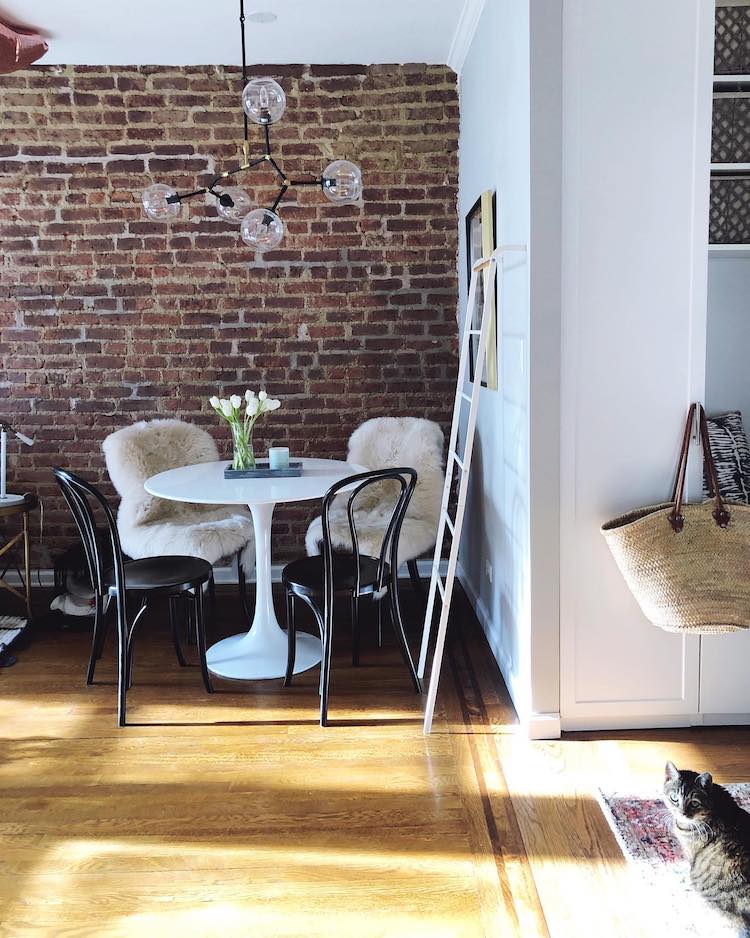
Thank you! I love to cook and entertain (well, pre-COVID I did!), and so I wanted to be sure that I made space for a dining area, even if it had to be a small one. I’ve always been a fan of Thonet chairs, and when I saw the black ones I ultimately ended up snagging from Crate & Barrel, I thought they were the perfect mixture of old and new: They looked like the real thing, but unlike a vintage Thonet, they were sturdy. That said, wooden chairs with zero padding aren’t always the comfiest, and comfy is my jam, so I made like the Scandinavians do, added sheepskin rugs as chair pads, and never looked back!


The pre-war character of your home is so unique. Was it difficult to maintain its charm while making it feel new and fresh? How did you balance making it feel old and new at the same time?
Thank you! When I started my apartment search, pre-war was my #1 requirement. It’s relatively easy to find a new build in New York, but I wanted that history and charm! My apartment complex was built in the 1920s as a home for displaced clothing workers—it was actually sponsored by the Clothing Workers Union! It features European-influenced Art Deco architecture and includes amenities rarely seen at the time, such as a nursery, a roof garden, and an auditorium. Perhaps my favorite feature is the giant windows, which can be found in every room. The apartments were designed to maximize airflow and sunlight—something strongly absent in the tenement buildings that characterized the neighborhood back then.
With all this in mind, I wanted to make sure that my renovation was less about “modernizing” and more about restoring my apartment to what I imagined to be its original glory. Rather than putting in a standing shower in the bathroom, I splurged on an antique clawfoot tub and had it refinished. I tore out the old, broken penny tiles on the floor but replaced them with the same. I added crown molding throughout and refinished the hardwood floors, patching them in the places that were beyond repair. Though my furniture and light fixtures are modern, I’ve infused antique pieces throughout the space and am constantly on the hunt for little ways to make the history of the space shine.
Your living room decor is so chic and full of personal touches. What are some of your favorite pieces?
Thank you! I think my favorite piece (which I get asked about a lot!) is the antique dresser that sits underneath my TV. Though it’s nothing fancy (it’s actually chipping in many spots!), it belonged to my grandma. In my previous apartment, it lived in my bedroom, but when I moved here, I realized there was no bedroom wall on which it might fit, and pivoted to reuse it as a media console of sorts. Beyond that, I’m partial to the mini disco ball I have hanging from my windows, which dapples everything in a little bit of magic, and all the flea market scores I have scattered around my bar cart and on my bookshelf. I love nothing more than “the hunt” and may have one too many tchotchkes, but hey—at least each of them has a story!


We love that you didn’t paint the brick in your living room and kept it original to the space. Was it in that good of shape when you moved in, or what was the process like to refresh it?
This is my favorite story to tell! When I first saw the apartment, that beautiful brick wall was fully hidden behind plaster. A month or so into my renovation, the electrician came to relocate the outlets (they had to be moved higher to bring them up to code). To do so, the team had to chip away at the plaster. And guess what they found once they chipped away at the plaster? Brick. The look my contractor gave me when I asked him if everything behind the wall was brick could only be described as pure hatred (chipping a giant wall of plaster is no fun at all), but with a little persuasion, the wheels were in motion, and within a week, I had a glorious exposed brick wall where one hadn’t been before.
Because I had to spend a bit extra for the team to chip away at the plaster, I decided to leave it unsealed (paying to seal it would’ve been expensive!). About a year into living with it, I realized the wall was literally shedding dust and enlisted my mom and sister to help me DIY seal it with a brick sealant I found at Home Depot. A handful of hours and some very achy arms later, it was no longer shedding, and I’m thrilled to say that nearly seven years later, it’s holding up incredibly well.
It is by far my favorite thing about my apartment (the only thing that could’ve pushed me further into pre-war heaven would’ve been original tin ceilings!), and it feels all the more special knowing that it had been hidden for decades and was technically discovered by accident.


Art definitely makes a statement in your home. Where do you source from and which piece(s) do you love most?
I don’t really consider myself any sort of art connoisseur, and as a result, I think the art I own is a bit all over the place. I tend toward flea market finds and try to keep in mind that just about anything can be art (for example, I have an old European eye test chart I bought at a flea market in Portugal in my bathroom!).
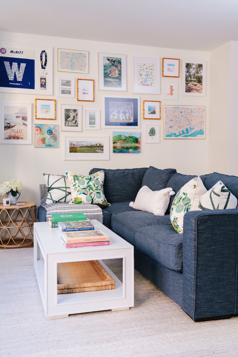
If I’m at a flea market/antique shop/thrift store, you can be sure I’m scouring it for vintage prints and frames (remember, you can toss art you don’t love and reuse the frame!). Some of my favorite art pieces are old prints I snagged for less than $10 and framed inexpensively.
For those just starting out/with smaller budgets, I highly recommend online print shops like Juniper. I’m a huge fan of Jenny Komenda (a true inspiration and design blog OG!) and what she’s done with Juniper. I love how she sources different artists and curates collections, and I think her design know-how fills a hole in the market that other online print shops cannot match.
Etsy is also a great source for digital downloads! I print from Costco.com and then frame in IKEA if I’m looking to be budget-friendly or Framebridge if I’m willing to splurge on a custom frame. Last fall, I did a room makeover for a member of my IG community in Brooklyn and sourced all of the art in the space from Etsy for under $50.
On the pricier side, I recently invested in a piece from an artist I found on Instagram named Benny Cruz and am saving up for a purchase from Josh Young Design House (I adore his aesthetic!). I imagine my tastes will continue to shift over time, but for now, I’m happy to have an eclectic collection–every piece has a story or memory associated with it, and that’s how it should be!


There are a lot of books in your living room! What is your favorite?
I LOVE to read and usually get through 50 to 60 books a year. I could talk about books all day long, but I’ll spare you and tell you that if you are to read anything, you should read Middlesex by Jeffrey Eugenides, which is my favorite book of all time. Eugenides is better known as the author of The Virgin Suicides, but he won a Pulitzer in 2003 for this epic novel, which is home to my favorite literary quote of all time and which I still think about often, despite not having read it in years.
Can we take a moment to talk about your clawfoot tub? It’s so dreamy, but how the heck did you find it and then get it into your apartment? What is your advice for other renovators in the city who need to get larger items like appliances, new cabinets, and tubs into their home?
OK, I know I said my brick wall is my pride and joy, but can I say the same about my tub? From the moment I knew I’d be gut renovating a bathroom, I started fantasizing about a clawfoot tub. The one you see in my space had quite the journey: It belonged to an old client of mine, who’d had it sitting in her garage for years. She sold it to me for $300 (a steal for a real vintage tub!), and I paid $600 to have it reglazed/made good as new.
As for getting it in here, two of my very strong guy friends drove out to said client’s house in New Jersey and picked it up for me, loaded it in a van, and then somehow (to this day, I don’t quite know how!) got it up the stairs to my building and into my tiny 1930s elevator. The thing weighs at least 300 pounds, if not 500, and yet they did not drop it once. They got it into my living room, where it sat for a good month before being reglazed, and my contractor and his guys juuuuust squeezed it into the bathroom once it was tiled. Though I’d measured, I hadn’t accounted for the depth of the tile, and the tub just fits.
In New York, you need something called a COI (certificate of insurance) to move anything big or heavy (appliances, large pieces of furniture, etc.) into your building, but I somehow managed to sneak the tub in without one. Shh—it’s our little secret.
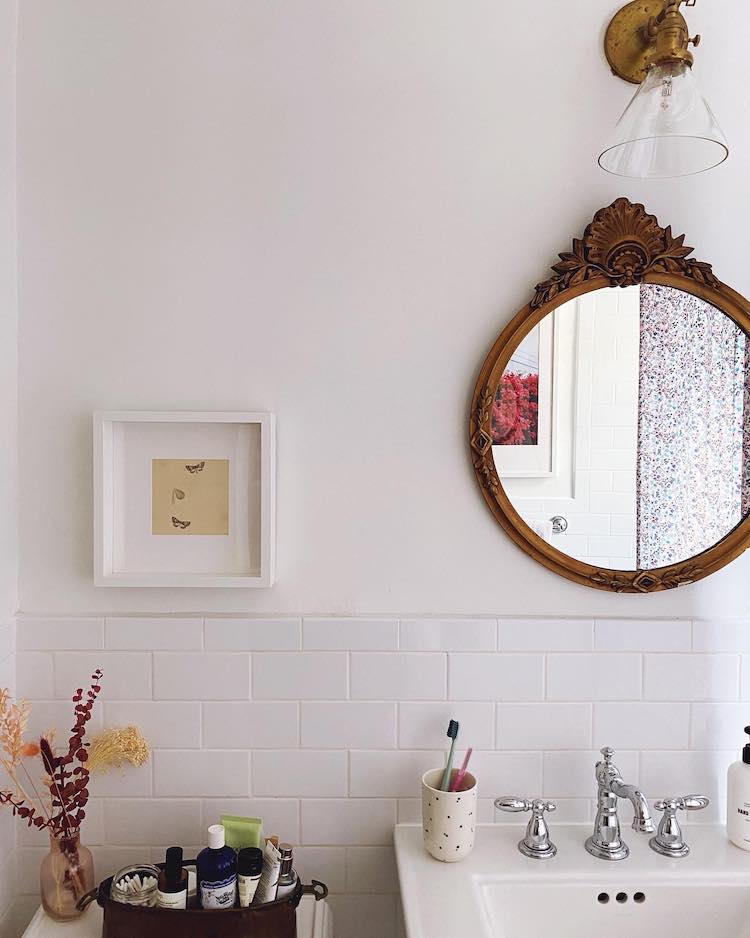
Tell us about your bathroom mirror. It is the perfect size for the spot it’s in. Is this a vintage piece or did you specifically source that for the space?
It’s vintage! I’d been hoarding vintage pieces for years; there’s nothing that makes me happier than a flea market day. This particular piece was found in an antique store in Maine. I bought it without 100% knowing it would fit or work in the space (I’d closed on the apartment but hadn’t yet started demo), but it was only $40 and I figured I’d find a home for it somewhere. This has generally been my approach for all flea market finds: buy now, find a home for it later. It’s not failed me yet!


We noticed that your bedroom is mostly neutrals whereas the rest of your home has pops of brighter colors. Is this how you have created such a bright yet cozy bedroom? And what are your best tips for doing so?
While you’re right that I appreciate pops of color elsewhere, I’ve purposefully kept my bedroom mostly neutral. New York City is a high vibrational place, and it’s important to me that my home—and my bedroom in particular—is a little sanctuary amongst the craziness. My bedroom is quite small (though not a bad size for NYC!), and the neutral color palette helps it feel light, airy, and (I think!) a little bit larger than it is.
When I first moved in, I kept the bedroom walls white (the rest of my space is painted a Stonington Gray by Benjamin Moore) but quickly pivoted to gray to add a bit of depth to the room. This paired with an all-white bed (my #1 tip for making things feel calm and peaceful!) + light, airy linen curtains = a space that feels like a deep, cleansing breath.


We can’t help but notice the vintage details and interesting light fixtures you have in every room. Where are your favorite places to shop for decor that feels collected yet curated?
Lighting is one of my favorite things to shop for—it’s incredible how much a new fixture changes a space! There are approximately a zillion online lighting retailers, but I’m partial to Schoolhouse Electric (I’d say 50% of my lighting is from there!) and CB2 (an expert at fun, trendy pieces that don’t break the bank). I also love finding one-off pieces at flea markets (broken record over here) or smaller Etsy shops (Etsy is a treasure trove!). Anthro has a great lighting selection but can be pricey, and I’d consider selling a kidney for a Kelly Wearstler or Aerin piece. Lastly, if I could shop at one store only, it would be Jayson Home—their ever-evolving, eclectic selection is truly incredible! I’d have to win the lottery first, but hey, a girl can dream.
Now that your renovation is finished, what ended up being your favorite project or transformation and why?
Oh gosh, don’t make me choose! Can I pick three? Kitchen, because I love to cook and bake and it’s the perfect space for doing so. Brick wall, because it was a surprise. And bathroom, because clawfoot.
You mention wanting to do another big renovation (potentially a house upstate)! What excites you the most about taking on a project on a much larger scale?
Doing a gut renovation on my own meant that I made a lot of mistakes. There were questions I didn’t know to ask, plans I should’ve made (lighting and electrical) but didn’t, decisions I would make differently if I could go back in time. In short, I feel like I learned so much, and it’s a shame that I can’t go back in time and put that knowledge to work on this space, but it means I’ve got designs on doing it again—but bigger and better.

Your cat, Penny, is practically a celebrity on your Instagram. How old is she, and why did you name her Penny?
I’m so glad you asked! She is indeed the celeb of the family. She’s 13 and is named after the Beatles song (her full name is Penny Lane, also known as Pen, P, Pens, Peepers, and, my personal favorite, Penneluh, which is the Yiddish spelling!).
You have fresh flowers in almost every room. What is your favorite kind?
It’s a tie between dahlias, ranunculus, and peonies.
We know you love to cook and bake. What’s your specialty?
Salted chocolate chip cookies!
If you could have lunch with any woman, who would it be and why?
An impossible question! I’m going to give a writerly answer and say Nora Ephron. I’d also be thrilled to dine with any of the following women: Lisa Taddeo, Brandi Carlile, Brene Brown, Shonda Rhimes, and Jodi Picoult.


 "
"


