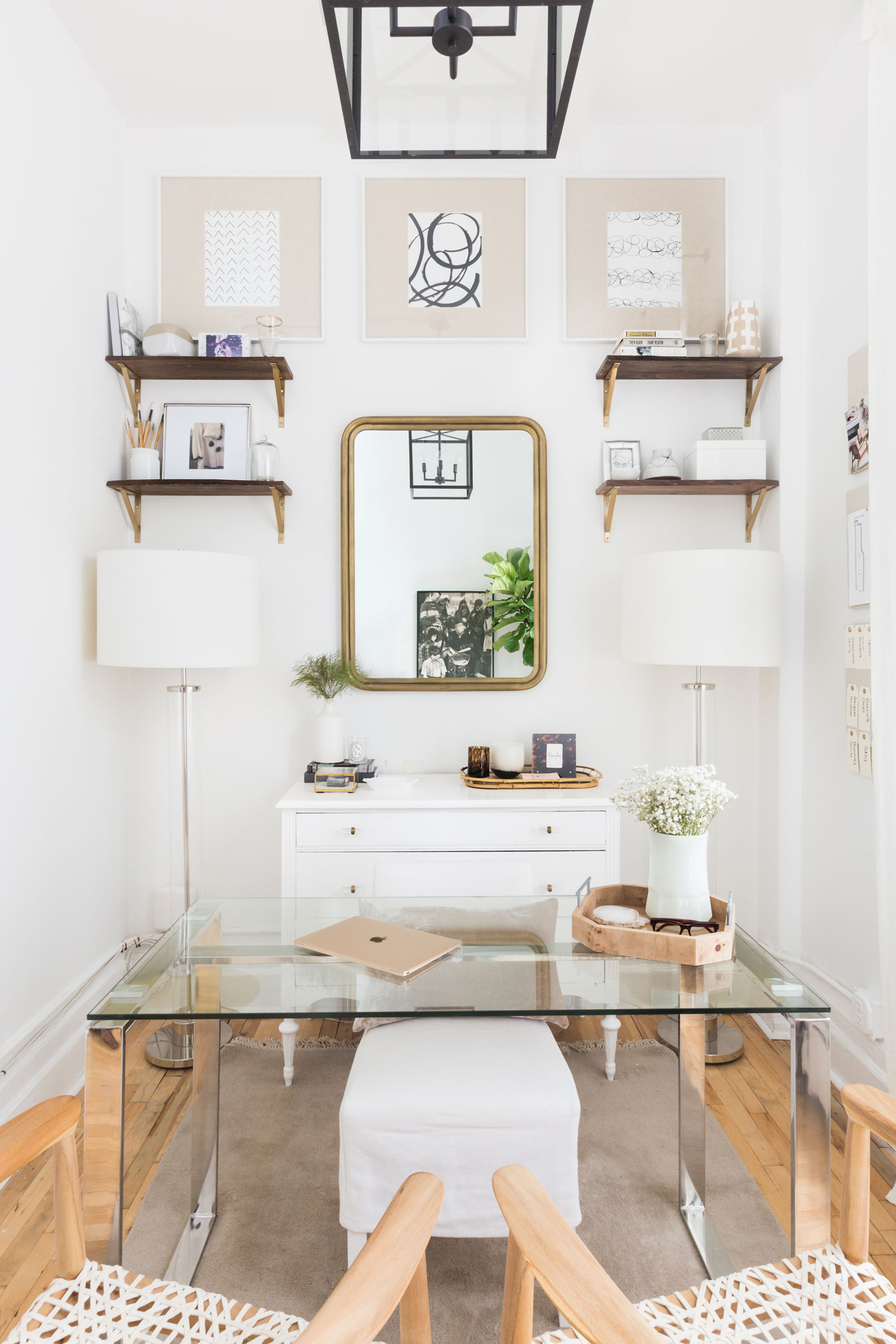
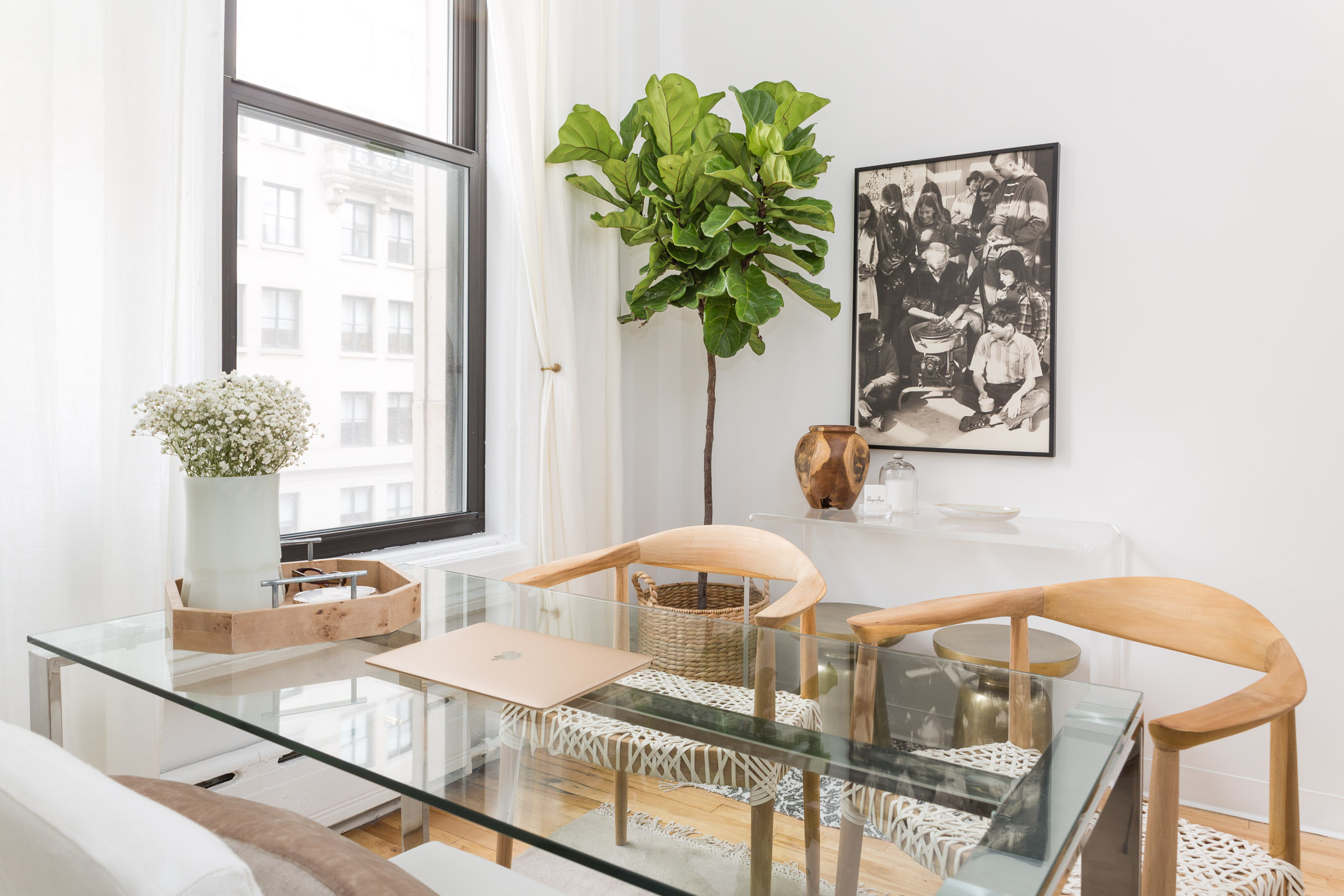
When it comes to decorating a space, I am all but clueless on most fronts. I’ve had the same furniture pieces and framed photographs for the last who knows how many years, and now that I’m trying to be an adult, I can use all the help I can get with choosing accent pieces and not-IKEA furniture.
turns out, you don't have to spend all of your free time cleaning
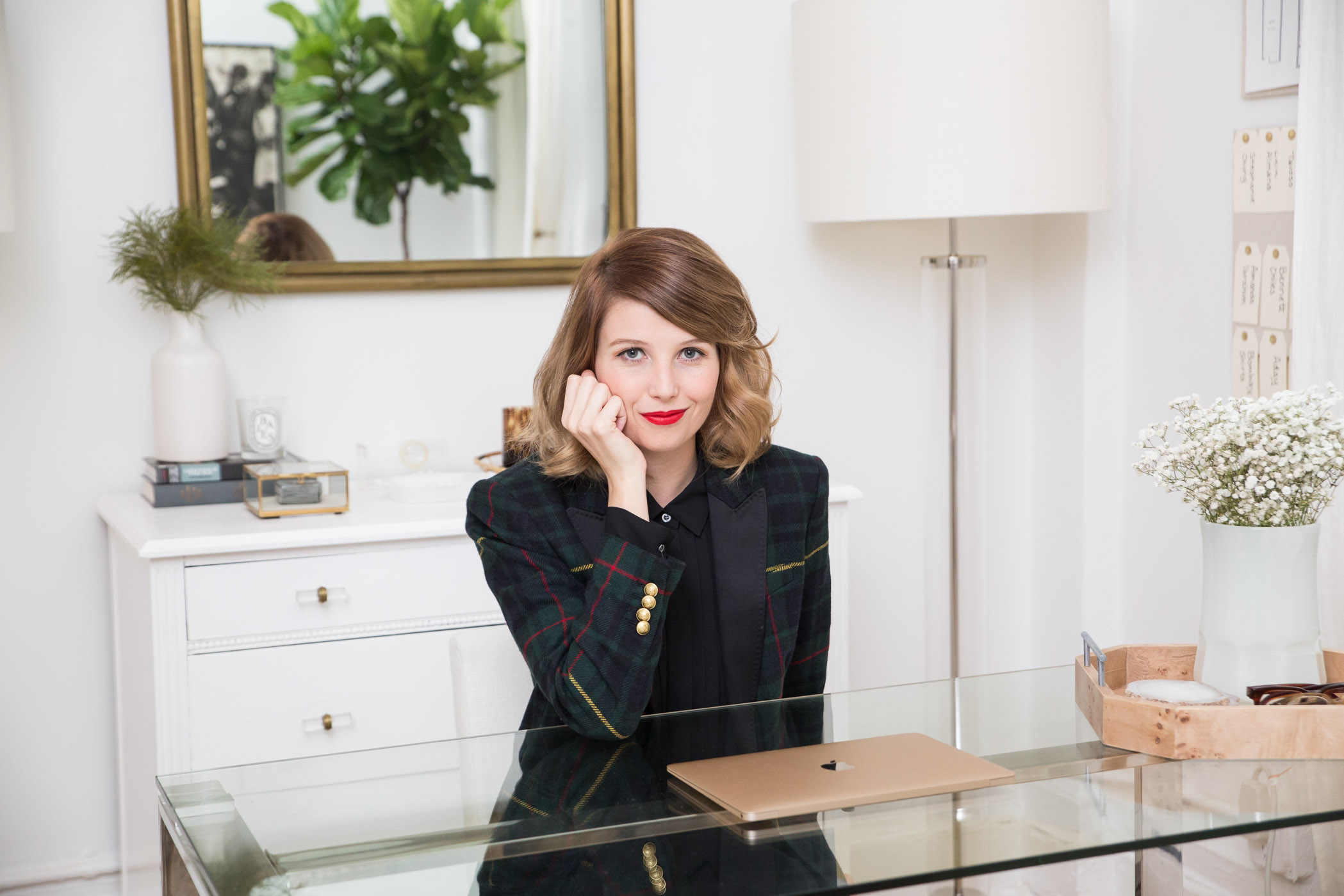
Enter Megan Hopp, interior designer extraordinaire (check out her *ah-mazing* home tour). Today we’re stepping inside her beyond gorgeous New York office and asking her 10 of our most perplexing decor and design questions. So imagine you’re taking a seat as her new client and take in all the fabulous tips and tricks on how to decorate our spaces like a pro.
Help! I’ve got kids/a pet/a dirty roommate, but I *love* white furniture. Can I have it all?
I get this question a lot, or rather a request that goes something like this: “I love the look of a white space, but I want pieces that stand up to anything and are incredibly low maintenance.”
Having a low maintenance room that is light and bright is doable! Having a white couch that stands up to stains is not. No matter what, white furniture is something to be careful with. Sure, certain fabrics are a little easier to maintain than others, slipcovers can be washed, etc., but when it comes down to it, a white couch requires a certain set of behavior and care.
However, you know what doesn’t require a ton of work? A light grey or light beige couch! I highly recommend selecting grey or neutral upholstered furniture and then using white in other elements of the room, examples being: paint color, window treatments, and all other non-upholstered furniture. Your light grey couch will suddenly feel lighter and brighter than you had ever imagined.


Where should I look for furniture investment pieces? Which pieces do you recommend I splurge on?
Your sofa! Non-negotiable: your couch, sectional, or sofa is the most important piece to invest in. My rule of thumb is that upholstered, a piece’s quality is directly related to cost, whereas in dealing with wood, metal, stone, and any other hard material piece, you can get quite clever with lower cost options.
What’s the key to a great gallery wall?
I have three rules for putting together a gallery wall:
Have at least one throughline. Maybe this means all the frames are walnut, or all the art is black and white photography — have at least one running theme that each piece holds true to.
Hang an odd number of frames, whether that be three or twenty-three. I say that decorating is much like comedy in terms of the “rule of three” — an odd number is always better looking (probably funnier too).
Speaking of three, think of creating your gallery in terms of three different size groupings; small, medium, and large. You only need a few large pieces (often just one, depending on the size of your gallery), then fill out the combination with mostly medium size pieces, and finish up with a moderate amount of smaller frames.


My living room is tiny — how do I make it intimate but not crowded?
My answer to small spaces often comes back to “You don’t need as much as you think.” People get it in their head that a living room has a certain list of pieces that NEED to be there (two armchairs, a media console, a coffee table), I think this theory comes from living room layouts on sitcom sets! Give the room just enough, and not anything more than it can realistically accommodate.
You will enjoy your space more, and it will serve you better if you let the room dictate how the layout will go. Not every room can fit everything, so I urge clients to be open to re-thinking what is absolutely necessary to have in their space.
My living room is massive — how do I embrace the spacious and also bring it all together?
Like the question above, the reverse is true also. People will say to me, “Oh but I don’t need any more seating,” and I say “But your room most certainly does!” Again I tell clients to drop the formula — design is SO far from one size fits all.
Top pieces to think about in a large space are appropriately sized area rugs (nothing kills me more to see a little 5×8 rug drowning in a big open room). Large lighting is very important (this goes for overhead, wall, table, and floor) — tiny lights in a large room do not support the space.
Finally, layout: when you have a substantial room, it means you have options — most likely there will be an opportunity to create subspaces within the room, and this will help to fill the space so that it is comfortable and doesn’t feel like you might hear an echo if you were to say “hello.”

How do I light different spaces if I don’t have recessed lighting? Where do you recommend I look for affordable lighting fixtures?
I never did meet a table lamp I didn’t love — okay, that might not be true, however, I LOVE LAMPS, and I don’t think people use enough of them. Truly, I do not think you need overhead or wall lighting to make a space chic and well balanced in terms of light. I advise clients to put lamps in places other than on a side table. Tops of bookcases are great, pianos, wall shelves, mantles, you name it. All this is to say, survey every surface you have in the room and make a plan accordingly.
In terms of affordable lighting, Target remains a favorite spot to look for lamps at a really great value. I also HIGHLY advise hitting your local thrift store — lamps are not difficult to rewire, so no need to worry about whether or not it even works.
Finally, I would like to talk about battery-operated lighting options. There are products on the market that are battery-operated pendants and sconces you can attach to your walls and ceiling wherever you like!
This pendant is a personal favorite of mine, and I use it constantly. However, I’m not done yet. I rip off (I mean carefully remove) the original pendant shade and replace it with some sort of attractive drum or orb shade, and the result looks just like this.
What are some easy tricks to make a room look pulled-together?
To give a room a quick spruce-up, the top five things I would suggest doing to really make a change are:
Paint the walls: Something different, or a better version of what you have now, an example being turn your “kind of white” walls into WHITE walls.
New floor coverings: A new area rug can COMPLETELY change a room, and can bring out a new look in your already existing furniture.
Different art & wall decor: Whether it be re-arranging, adding new pieces, or completely starting from scratch, what’s on your walls can definitely change the space.
Rearrange your furniture: Of course this only applies to rooms that have enough optionality to allow for this; however, if you do, it’s a refresh that will give you a new perspective.
Switch up the palette: Do you have blue pillows and accessories? How about swapping them out for green and grey pieces instead? Simply changing the palette of the “small stuff” can make the big picture shine a different hue.


What colors are best for what rooms?
For small rooms (especially those with low ceilings), I always recommend darker, more vibrant colors, as well as wild and crazy wallpaper prints. Small rooms are to be thought of as a juice glass quantity of color and pattern — very concentrated and bold.
Medium size rooms, as you might have guessed, are the most flexible in terms of light to dark, pattern, or no pattern. Of course it depends on the specific details of the space, but generally speaking, there are really no pitfalls here.
In large rooms, I lean toward lighter colors and simpler prints (see where I’m going here?). A big open room is a great opportunity to go white. I also like to stick to neutral shades in large spaces and use color through other elements of the space like window treatments or accent decor. I prefer large scale or geometric prints when it comes to wallpaper in a big room — a small pattern over and over for miles on end is far too dizzying.

What suggestions do you have for someone looking to slowly update their spaces? Where’s a good place to start?
I don’t have the most fun answer for this question. I would love to say something like “Go buy a few new vases today, in a month throw in some pillows, and presto!” I fundamentally do not feel that way about decorating and design. I live by the big-to-small trajectory of a space, meaning start with large pieces, move into accent furniture, and finish up with lighting and decor. Some people have a real knack for this kind of thing and can move through the process a bit more willy-nilly, but for most folks, big to small is the key to a well-thought-out room.
The second part to this is that when you are not buying everything all at once, you don’t need to have a full scope plan prior to the purchase of your couch. You can start with just one piece — just make sure it’s central to the space (and that you love it). From there, build brick by brick, making sure that each new piece fits in the puzzle you have previously put together. As you might imagine, flexibility and optionality will narrow as you move through the process, but by the end, your vision should be clear enough that selecting those finishing touches will be the obvious icing on the cake.
What’s the simplest way to elevate a room?
Updated lighting, in any and every place you can put it, is the fastest way to make a dynamic change in a space — and this goes for every single type of room in a home. In bathrooms, I find that people just don’t “decorate” at all, they pick the tiles and the floor, and the vanity, and then stop. Wall decor, shelving, accessories and textiles are such important tools to take your bathroom from forgettable to noteworthy.
Finally, don’t forget about the space in your place that lives above 32” off the floor! The most common thing I see at the start of a project in bedrooms, offices, living, and dining rooms is a bunch of furniture that is all the exact same height (and not very high at that). Use your walls, please, I beg of you! It’s more of a hassle (I know) to mount a bookcase or hang that large mirror, but your room will thank you, and you will then thank your room.

I rent my apartment/house. How can I update my space without adding paint or putting big-time holes in the walls?
I suggest LARGE leanable or freestanding pieces in a rental space where you don’t want to get into the business of getting friendly with your walls. If a gallery wall feels like a move you don’t want to make, find a long console table and several pieces of tall and sizeable art to lean and layer across the width of the table to create the same look and feel.
Same with shelving — maybe wall-mounted storage and display is too invasive, so look for open bookcases or etageres, then try pairing two or three of them together side by side for a “built-in” and more substantial look. Ask yourself “what is the other way” I can make this happen?
In your opinion, what design trends are not worth investing in/do you wish would just disappear?
I hate microfiber. It’s not making anyone’s life better.


 "
"