Seven years ago, the (remarkably beautiful) couple behind Studio McGee sold their California home to chart a new path: starting their own interior design business. Since then, they’ve acquired 3 million Instagram followers, launched a home goods line with Target, and shared enough drop-dead gorgeous interior photos to keep us mesmerized for days.
Thanks to Shea McGee’s signature style, I can almost instantly spot a Studio McGee image on my Instagram feed. The designs have a clean-yet-collected vibe, which manages to effortlessly balance laid-back, California style with sophisticated and luxurious details.
Below, we’re sharing the seven home styling tips we’ve learned from Studio McGee since we first started fangirling many years ago.
1. Mix masculine and feminine details
Balance can always be found in a room designed by Studio McGee, and juxtaposing masculine and feminine details is a trend you’ll find throughout their projects. Try layering moody leathers with light and airy linen or soft, vintage floral rugs with wood accent tables.
2. Forgo the furniture set
As tempting as it is to head to your nearest big-box furniture store and order a furniture package in one fell swoop, Studio McGee’s room designs will be your greatest incentive to resist. As the team shares in this blog post, mixing styles of furniture offers a more thoughtful aesthetic and also allows you to combine investment pieces with budget finds to create a balanced room that suits your individual budget.
3. Make the entryway a moment
The entryway is often overlooked in favor of higher priority rooms like the living space and primary bedroom, but Studio McGee’s entryways will give you pause for this approach. Instead, focus on making your entry a feature with an accent table, lighting, and a few simple, functional accessories. Its smaller footprint will make it a quick and inexpensive project, which means you’ll get to enjoy the fruits of your labor in no time.
4. Contrast is key
While most Studio McGee rooms can be found decorated in a neutral color palette, contrast remains a highly utilized element. Pairing light and dark features against one another adds interest and depth, as seen here in this light-filled kitchen with moody, black kitchen cabinetry.
5. Wall-to-wall carpet is not the enemy
Admittedly, we feel like we’ve been sleeping on wall-to-wall carpet as a bonafide interior design feature. For a more high-end feel, opt for carpet that’s looped rather than cut, which will offer a textural element to your space that is reminiscent of sisal or jute. We particularly love this styling tip for bedrooms—after all, whose tootsies want to wake up to chilly flooring first thing in the morning?
6. When in doubt, add greenery
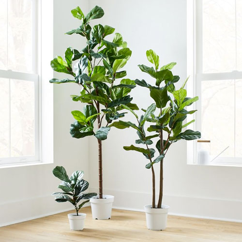
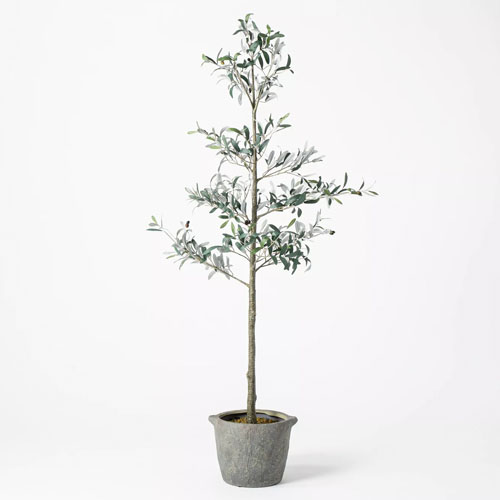
A quick scroll through the Studio McGee Instagram feed will leave you hard-pressed to find an image without a bundle of greenery on a tabletop or even an actual tree tucked away into a corner. This finishing touch infuses literal life into each space, thanks to a hearty injection of color and texture. It can also be a super budget-friendly hack—just head to your backyard for a few extra tree clippings that will make all the difference when styled in an oversized vase on your coffee table.
7. Utilize textiles for pattern and color
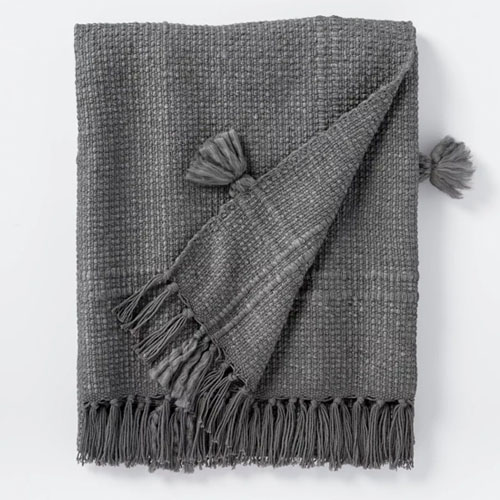
The Studio McGee team almost always opts for neutral furniture staples while allowing accent textiles (i.e. throw pillows and blankets) to bring in added patterns and pops of color. As a budget decorator myself, I greatly appreciate this rule of thumb since it means I get more longevity and versatility from my furnishings and investment pieces. Moral of the story: You can never underestimate what a difference details and accessories can make in a room.
STUDIO MCGEE FAVORITES


 "
"


